Analytical Dashboard with Python Flask, Pandas and MongoDB
Analyzing your sensor data has always been a daunting task and putting your data in the Dashboard has never been an easy task. In this article, we will see how using Python Flask, Pandas and MongoDB you can develop an Analytical Dashboard over a weekend. Here are some of the items that have been used to build the Dashboard.
- Flask: A web framework for Python to build the Dashboard
- Pymongo: For Reading/Writing the data from the Mongodb using Python
- Pandas: For Cleaning, Manipulating and Converting the data in Dataframe Data structures which can be consumed in the datatable
- Datatable: Jquery plugin to showcase the pandas dataframe on the dashboard
- Google Map API’s: To display the mobile sensor data i.e. lat long on the map
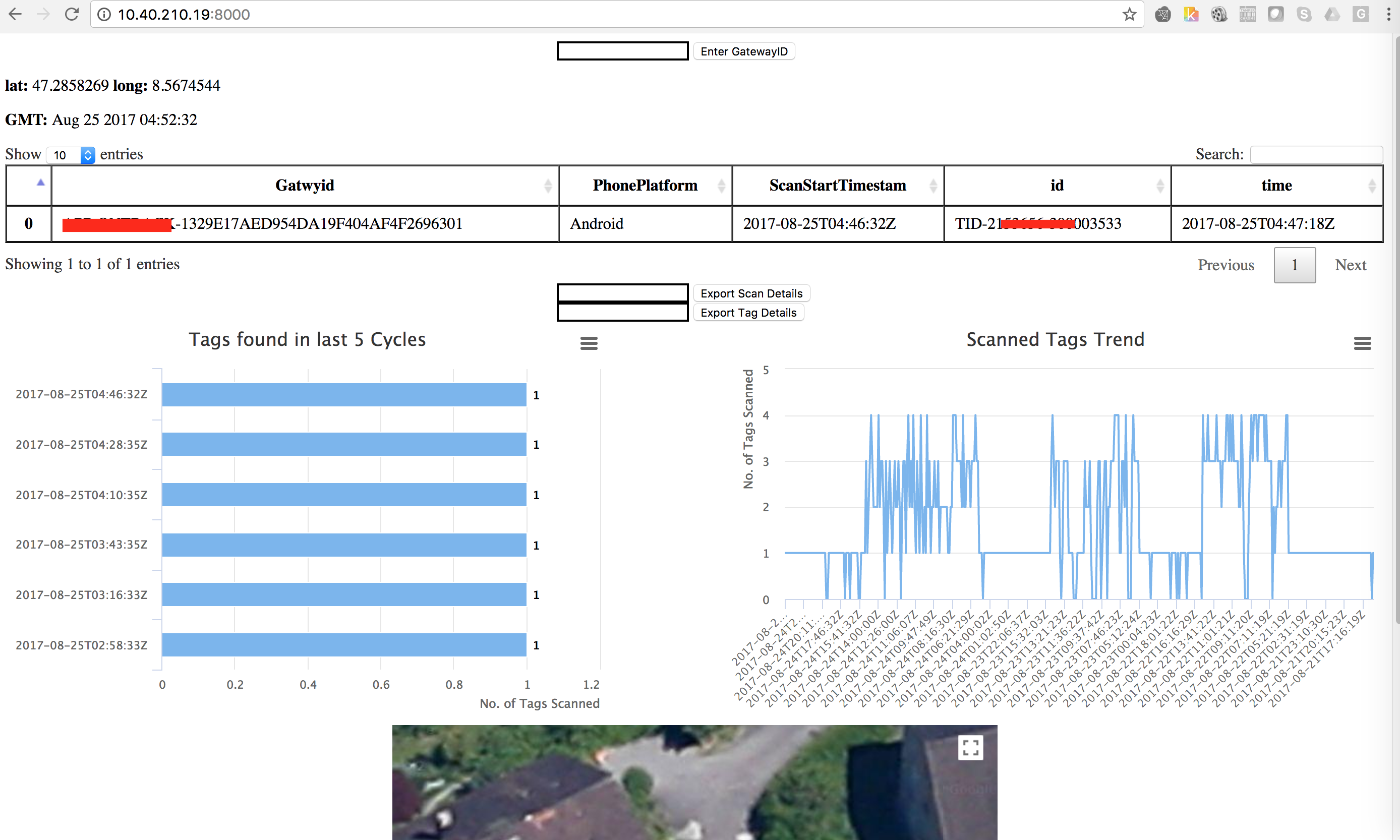
In this article I’m not focusing on the basics of python flask and assumes that anyone reading this has basic knowledge of Python and Flask Web framework. The first step would be create the route for the page load(127.0.0.1:8000) and what to be displayed on the page start. So I would be interested to show the Table containing the first record from the mongo query and two charts which will show the trend of the No. of items scanned or the data from the other records from the mongo query.
Querying the MongoDB:
cursor=collection.find_one({“data.msg.payload.Mobileidentifier”:MobileID},sort=[(“data.msg.payload.ScanStartTimestamp”, -1)])
So I’m trying to run a Query to find the first data with respect to a specific mobile gateway and sorted in Descending order, which will give me the latest record from the query.
Storing the Data in Python list:
if (cursor['data']['msg'][len(cursor['data']['msg'])-1]['payload']['NoOfidDetected']>0 and len(cursor['data']['msg'])>1):
     ScanStartTimestamp.append(cursor['data']['msg'][len(cursor['data']['msg'])-1]['payload']['ScanStartTimestamp'])
     MobileID.append(cursor['data']['msg'][len(cursor['data']['msg']) - 1]['payload']['MobileID'])
     PhonePlatform.append(cursor['data']['msg'][len(cursor['data']['msg']) - 1]['payload']['PhonePlatform'])
     time.append(cursor['data']['msg'][ind]['ids'][0]['_time'])
      beaconid.append(cursor['data']['msg'][ind]['ids'][0]['beaconid’])
We stored all the data in a Python list for each items to be displayed on the Datable i.e. ScanStartTimestamp, MobileID, PhonePlatform, time, beaconid.
Converting the data into Pandas Dataframe:
All the list created above is now created and stored in Pandas Dataframe
 df = pd.DataFrame(
  {'ScanStartTimestamp': ScanStartTimestamp,
  'time': time,
  'beaconid': beaconid,
  'MobileID':MobileID,
  'PhonePlatform':PhonePlatform,
  })

**Convert Dataframe to HTML and return to Template Engine:**

**df.to_html()**

@app.route('/', methods=['POST','GET'])
def index():

cursor=collection.find_one({"data.msg.payload.Mobileidentifier”:MobileID},sort=[("data.msg.payload.ScanStartTimestamp", -1)])
if (cursor['data']['msg'][len(cursor['data']['msg'])-1]['payload']['NoOfidDetected']>0 and len(cursor['data']['msg'])>1):
 ScanStartTimestamp.append(cursor['data']['msg'][len(cursor['data']['msg'])-1]['payload']['ScanStartTimestamp'])
 MobileID.append(cursor['data']['msg'][len(cursor['data']['msg']) - 1]['payload']['MobileID'])
 PhonePlatform.append(cursor['data']['msg'][len(cursor['data']['msg']) - 1]['payload']['PhonePlatform'])
 time.append(cursor['data']['msg'][ind]['ids'][0]['_time'])
 beaconid.append(cursor['data']['msg'][ind]['ids'][0]['beaconid’])

df = pd.DataFrame(
 {'ScanStartTimestamp': ScanStartTimestamp,
 'time': time,
 'beaconid': beaconid,
 'MobileID':MobileID,
 'PhonePlatform':PhonePlatform,
 })

return render_template("user.html",show=df.to_html())

 Template will look like this:

<div>

 </div>
Showing Google Map:
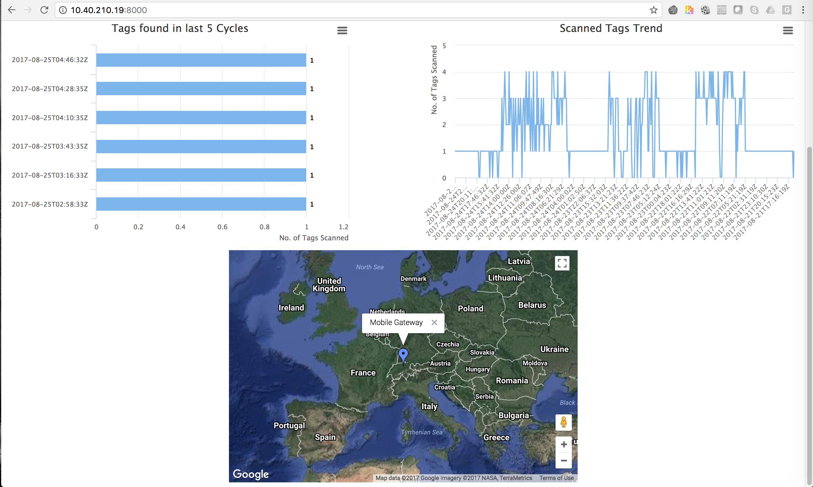
You have to return the lat, long and custom text to be displayed on the map to the template engine:
Tagloc=[lat, longi, 'MobileGateway-Loc']

<div>
      <div id="gcontainer" style="width: 600px; height: 400px; margin: 0 auto">
</div>

<script language="JavaScript">
function drawChart() {
   // Define the chart to be drawn.
    var data = google.visualization.arrayToDataTable([
       ['Lat', 'Long', 'Name'],
       ,
   ]);
   // Set chart options
   var options = {
      showTip: true
   };
   // Instantiate and draw the chart.
   var chart = new google.visualization.Map(document.getElementById('gcontainer'));
   chart.draw(data, options);
}
google.charts.setOnLoadCallback(drawChart);
</script>
Exporting the data from the Pandas Dataframe:
So Once the Dataframe is ready from the lists then you can use the below piece of code to export the dataframe as csv.
@app.route('/export', methods=['GET', 'POST'])
def export():

cursor=collection.find_one({"data.msg.payload.Mobileidentifier”:MobileID},sort=[("data.msg.payload.ScanStartTimestamp", -1)])
if (cursor['data']['msg'][len(cursor['data']['msg'])-1]['payload']['NoOfidDetected']>0 and len(cursor['data']['msg'])>1):
            ScanStartTimestamp.append(cursor['data']['msg'][len(cursor['data']['msg'])-1]['payload']['ScanStartTimestamp'])
            MobileID.append(cursor['data']['msg'][len(cursor['data']['msg']) - 1]['payload']['MobileID'])
            PhonePlatform.append(cursor['data']['msg'][len(cursor['data']['msg']) - 1]['payload']['PhonePlatform'])
            time.append(cursor['data']['msg'][ind]['ids'][0]['_time'])
            beaconid.append(cursor['data']['msg'][ind]['ids'][0]['beaconid’])

df = pd.DataFrame(
    {'ScanStartTimestamp': ScanStartTimestamp,
     'time': time,
     'beaconid': beaconid,
     'MobileID':MobileID,
     'PhonePlatform':PhonePlatform,
   })

    resp = make_response(df.to_csv())
    resp.headers["Content-Disposition"] = "attachment; filename=export.csv"
    resp.headers["Content-Type"] = "text/csv"
return resp
Template:
<div id="exptocsv">
      <form action="/export" method="POST">
        <input type="text" name="etocsvtext" style="border-color:black" minlength="44" maxlength="44">
      <input type='submit' value='Export Details' />
      </form>
</div>
So you have seen how easy it is to create an Analytical Dashboard within a weekend. To improve the look and feel you can add some css and fancy JS and HTML but that was not something I was looking for at this point in time, So I have created a bare minimum dashboard running on Python flask which serves our current need. Also the Python Pandas helped a lot to play with the data and display it in the required format