Get Started with Matplotlib - Data Visualization for Python
Why Visualization?
A human mind can easily read and understand a chart or image as compared to looking thru the large chunk of data in a table or a spreadsheet, Data visualization is a powerful technique to visualize and get meaningful insight from the datasets. For example, Bar graphs can easily tell you the monthly or yearly trends for your sale, expenses etc. or Pie chart can help you to find out what is the percentage of items from the total value.
So Data visualization is a more readable format to see thru the data.
Visualization for Python developers
Coming to the choice of Visualization library for Python developers, there are not much tools/packages available to give the entire flexibility like D3.js, which is a low level visualization library in Javascript and gives more control to the user to render the graphs as per their choice. Bokeh is comparable to D3.js to some extent but still D3.js has an upper hand in terms of flexibility and to do anything you like to do in the graphs.
However there are more powerful and robust frameworks for visualization in Python, Matplotlib is one of them, it is a 2D graphing library and supports both interactive and non-interactive graphs which can be saved into png,jpeg and other formats and it can be used along with the Ipython also. Primarily it uses python and is an open source & cross platform and developed on the lines of MATLAB. So matlab users will feel some similarity between both of these packages.
Installing Matplotlib
Install anaconda package from here, it’s a data science platform in python, it includes scientific and analytical packages, Some of these packages are NumPy, pandas, SciPy, Matplotlib, and Jupyter. After installing Anaconda, Open python terminal and check for the matplotlib version installed using below command on the terminal
import matplotlib matplotlib.__version__
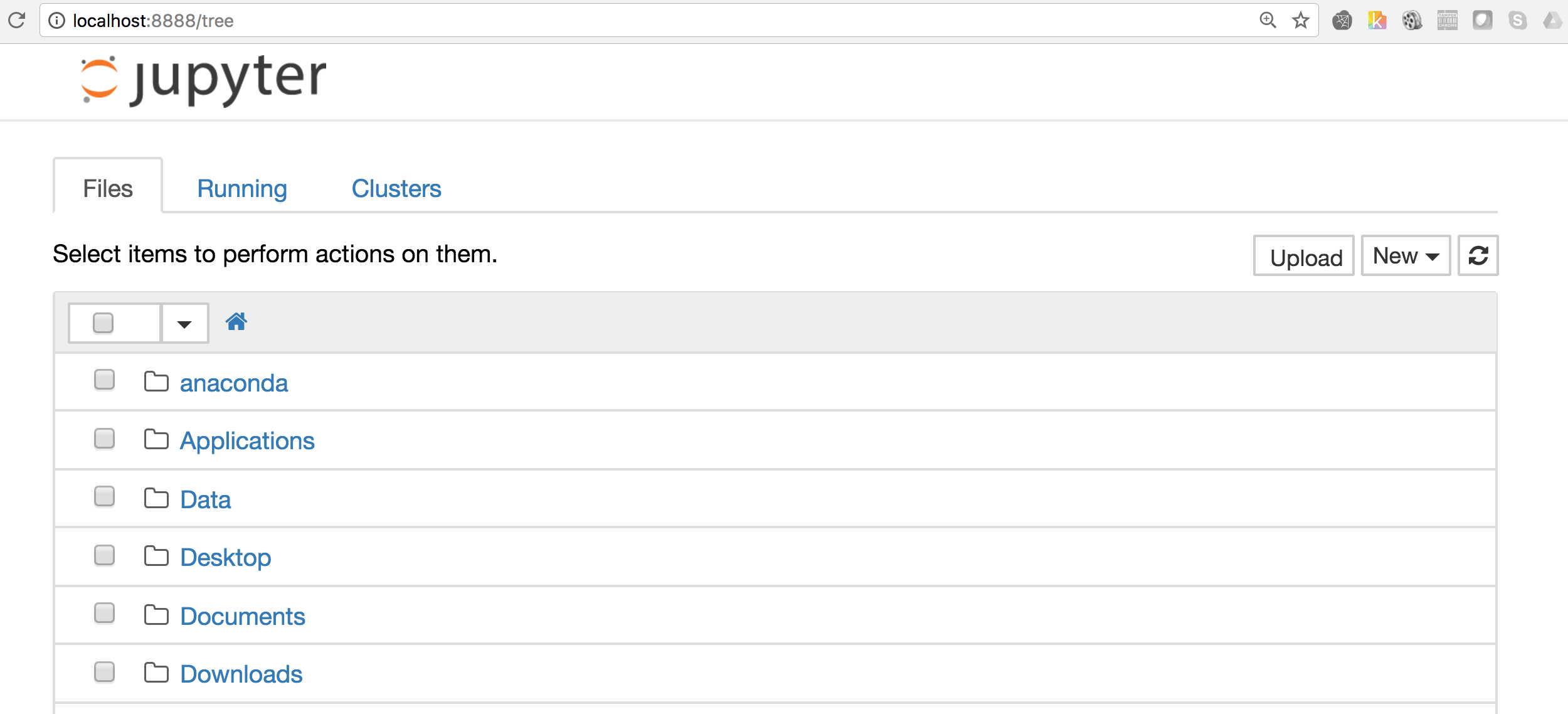
Ipython Notebook
Go to the terminal and navigate to the folder where you want to store all your tutorials and type “Ipython Notebook” and see a Browser with your current folder structure should be opened, something as shown in the image below
Plotting a simple graph
import matplotlib pyplot which is collection of command style functions similar to MATLAB. There are several function in pyplot which is used to create the figure and manages other parameters like plot area, labels, axes etc. Now using matplotlib only thing which you need to worry is about your data, once it is fed to matplotlib and specify the kind of graph that you are looking for then it does everything for you. %matplotlib inline # plot the graph in notebook import matplotlib.pyplot as plt #Import the pyplot library
We would be using numpy arange to create the array of values from 0 to 4. So here is the output for np.arange(4):
array([0, 1, 2, 3, 4])
This output will be fed to the plot function of pyplot:
plt.plot(np.arange(4))

Matplotlib considers the value of Y-axis and generates automatically the X-axis values accordingly. However plot function can take both X & Y range of values.
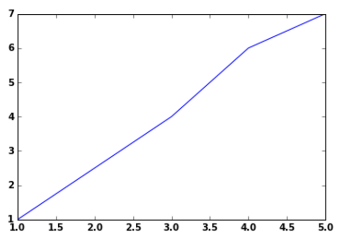
X=[1,4,6,7] Y=[1,3,4,5] plt.plot(Y,X)
Line Style:
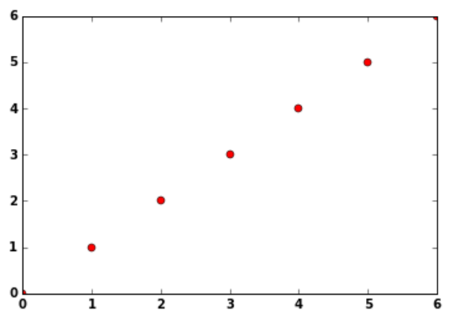
In the plot function there is a third optional argument, which is to control the line style, by default the value is blue dash(-) i.e. b-, however you can change it as per your choice, so if you wanted to plot red circles in the above graph instead of blue solid line, enter the third arg as shown:
plt.plot(np.arange(7),'ro')
Similarly for blue dotted lines ‘b–’ and green traingles ‘g^’ can be used.
Line Property:
Line has many properties that user can set as per their requirements, Complete list of the line attributes are shown here
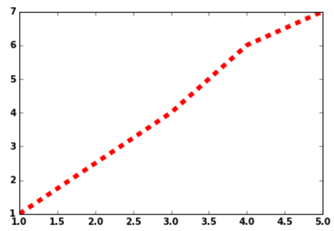
I will show how to use two of the line attributes linestyle(ls) & linewidth(lw), linestyle sets the type of line to be used like solid’, ‘dashed’, ‘dashdot’, ‘dotted’ and linewidth sets the width of the line, see this example below
X=[1,4,6,7] Y=[1,3,4,5] plt.plot(Y,X,lw=5.0,ls='--')
Axis:
One of the important factor in any of the graph is axis and it’s label, you can use plot axis function to define the X-axis and Y-axis labels for your graph, You need to provide the following parameters for axis function [xmin, xmax, ymin, ymax]
plt.plot(np.arange(7)) plt.axis([0,6,0,8])
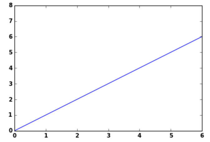
In the above plot you can see how the X-axis is divided between 0 to 6 and Y-axis divided between 0 to 8 as defined in the axis function.
Also, if you want to add any text anywhere in the graph then you can use plot text() function, which takes mandatorily 3 arguments i.e. X,Y as data coordinates and S as String or text other parameters fontfict and withdash are optional. so you can use this function if you want to add text in the above graph stating that this is a straight line or want to provide text for the coordinates
We will plot a simple barchart here and will add text(6th item) in red color to the plot
y = np.arange(10) x = np.arange(10) plt.bar( x,y, width, color="blue") #Bar Plot plt.text(3, 6, r'6th item',fontsize=12,color='red') #Adding text for the 6th element
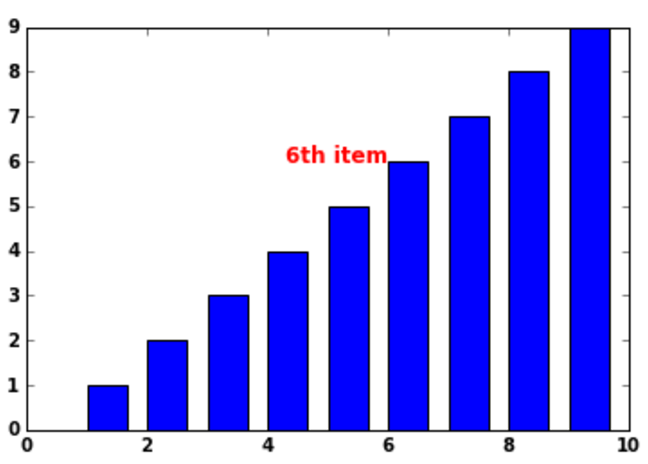
In plt.text() function the first two arguments are the coordinates(3,6) on the plot where you want to enter the text. Additionally you can provide the parameter fontsize & color if you want to highlight something in color or bigger fontsize.
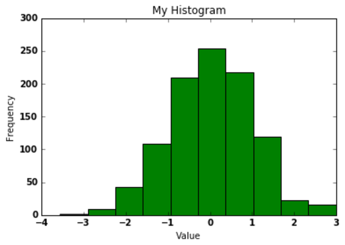
Now we want to label our X & Y axes and provide a title for the graph, Will plot a simple histogram and add these lables & titles to it:
randnumbers = np.random.randn(1000) plt.hist(randnumbers) plt.title("My Histogram") # Title of the Graph plt.xlabel("Value") # X-axis label plt.ylabel("Frequency") # Y-axis label
This was a small demo on how to get started with matplotlib for python developers, However matplotlib is much more powerful and helps you to draw the graph fast and effectively. Please check the matplotlib official website to take a deep dive into this.

