How to use AI powered Query in Google Spreadsheet
Dealing with data has always been a daunting task no matter how much data geek you are. Being a Data Scientist the moment I see a new dataset the first thing which comes to my mind is OMG! How would I clean or explore this data? Can I ever do a EDA(Exploratory Data Analysis) on this dataset to get some meaningful insight before we actually start applying some science on this data.
However I am relaxed once I learnt that Google is running a lot of AI, Machine Learning algorithms under the hood and it’s no more worry for a person who is not much experienced exploring the data or for a busy data scientist who needs a quicker look at his/her data first to understand and build strategy for feature engineering, which is an essential step of selecting or creating the right features to be used in a machine learning model
Google is one of the leaders in embracing the AI technologies and implementing it on their tool for the users. Google spreadsheet has always been a handy tool for the data explorers and analyst around the world to clean, analyze and manipulate their data and share within a team or group. Last Year google introduces this new feature Explore to generate the Pivot for your data automatically and this time they have embedded a Natural Language Processing Query Box which answers to the general query around your data.
How Do We Start?
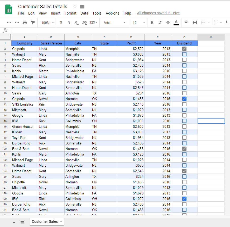
Step 1: Open a New Sheet and import data
Open a new sheet and import your data into this sheet. I would like to tell a shortcut here to open a new google sheet without going to google drive. Type sheets.new in the Chrome address bar and a new Unititled google spreadsheet opens up in the Browser. Go to File > Import and then import your data into this sheet. Here I’m using the Customer Sales Data

Step 2: Explorer Window
I love to see any data with Alternate coloring format which you can apply by going to Format > Alternate Coloring and then select the color you like from the right side bar
Now Click on the Explore on the bottom right of the sheet and a new right side bar will open.
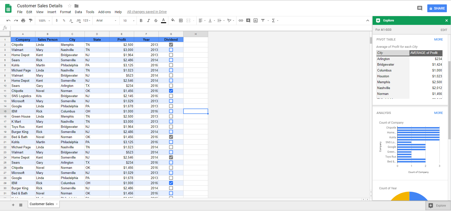
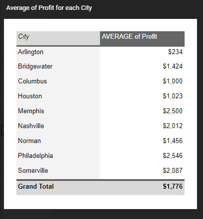
This Explorer shows a basic Pivot chart of the City and their corresponding average profits.
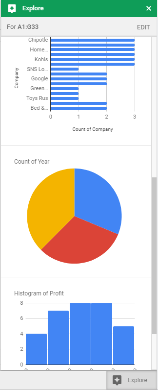
it also displays a bar chart, Pie chart and a Histogram. Basically it depends what type of data you have and it displays the basic charts accordingly.
Step 3: Querying your data
On the top of the Explorer window you can see a search box where you can write your query and press enter for google sheets to answer your queries. This is an important feature where you can ask multiple queries regarding your data. Here are few examples for this dataset
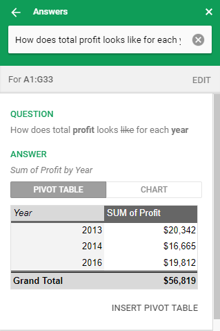
a) Type in the box: How Does the Total Profit looks like for each year
You will see a beautiful Pivot table showing the Total profits by year i.e. sum of total profits for each year
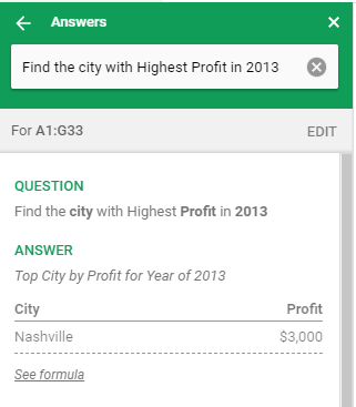
b) Type in the box: Find the city with Highest Profit in 2013
You will see the result Nashville, TN is the city with Highest Profit in 2013. Isn’t it cool
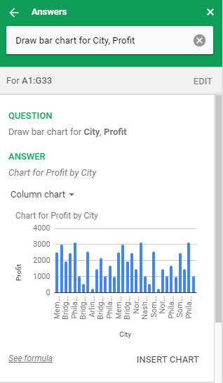
c) Type in the box: Draw bar chart for City, Profit
You will see the bar chart showing city on x-axis and profit on y-axis
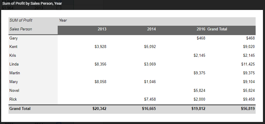
d) Type in the box: Sales Person distribution by year, total profi
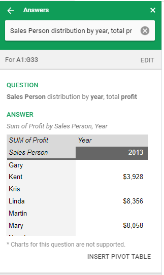
You will see a Pivot table with the Profit distribution of Sales person over the years
You can insert these Pivots and Charts into a new sheet by Clicking on the Insert Chart and Insert Pivot Table at the Bottom right of each answer. Also if you want to see the formula used to answer your query then click on the link at the bottom left.
So Adding machine learning to the pivot table is a major breakthrough. Instead of manually exploring the data to extract meaningful insight from your data, Google Sheets can suggest pivot table and shows all the probable graph from the features in the dataset.