Text Data Visualization in Python
The best way to understand any data is by visualizing it. if I give you a table load of data and Charts then the latter is more easier way to get insight from the data. Visualization is a critical part of any data analysis project and makes it easy to understand the significance of data in a visual way by looking at visuals and quickly helps to identify the areas which needs attention and helps to build a strategy for further Data Science activity.
Text Visualization has always been a challenging task as it needs to be converted into numerical features first which computers can understand, which is tricky because text is discrete
Whats is Scattertext ?
This is a tool that’s intended for visualizing what words and phrases are more characteristic of a category than others
Installation
pip install scattertext
Overview
We are going to use 2012 political convention data set and visualize what are the most frequent words used by Republican and Democrats Candidates
Import
%matplotlib inline
import scattertext as st
import re, io
from pprint import pprint
import pandas as pd
import numpy as np
from scipy.stats import rankdata, hmean, norm
import spacy
import os, pkgutil, json, urllib
from urllib.request import urlopen
from IPython.display import IFrame
from IPython.core.display import display, HTML
from scattertext import CorpusFromPandas, produce_scattertext_explorer
display(HTML("<style>.container { width:98% !important; }</style>"))
Load Spacy Language Model
For this step you have to ensure that spacy is installed on your computer and then you load the english language model
import spacy
nlp = spacy.load('en')
Load Data in Pandas Dataframe
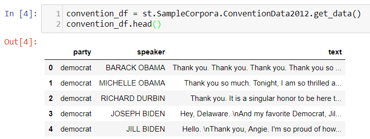
convention_df = st.SampleCorpora.ConventionData2012.get_data()
Preview Data
The Data contains three columns, first column “party” shows the party of the candidate he/she belongs to and second column is the speaker name and third column text contains the speech text
convention_df.head()
Parse Speech text using Spacy
SpaCy features a fast and accurate syntactic dependency parser, and has a rich API for navigating the tree. The parser also powers the sentence boundary detection, and lets you iterate over base noun phrases, or “chunks”.
convention_df['parsed'] = convention_df.text.apply(nlp)
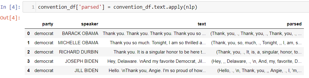
You can see the parsed text column and the text is tokenized after lemmetization and stemming
Count of Democrats and Republican speakers
print("Document Count")
print(convention_df.groupby('party')['text'].count())
print("Word Count")
convention_df.groupby('party').apply(lambda x: x.text.apply(lambda x: len(x.split())).sum())
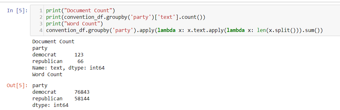
There are 123 speeches for democrat candidates and 66 speeches for republican candidates
Convert Dataframe into Scattertext Corpus
This is an essential step to reprsent the dataframe as Scattertext corpus which is an essential parameters for some of the functions that we are going to see in next steps
corpus = st.CorpusFromParsedDocuments(convention_df, category_col='party', parsed_col='parsed').build()
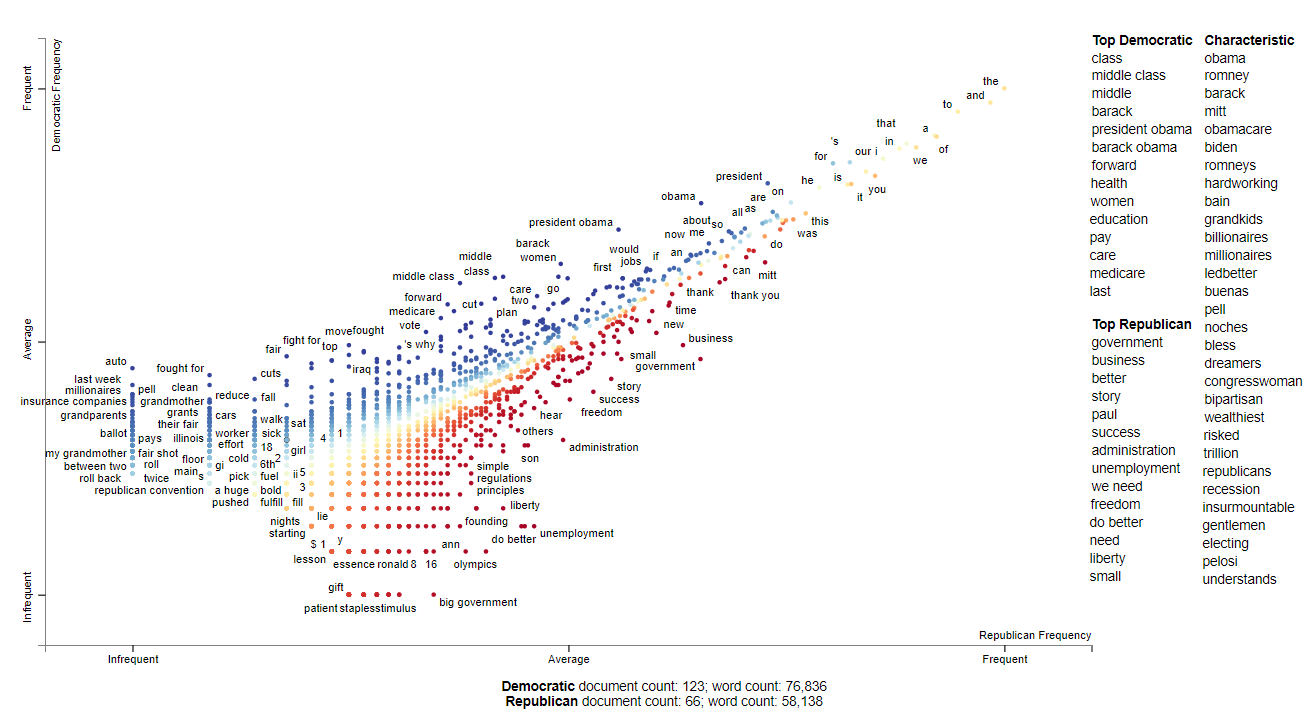
Visualize Chart
html = produce_scattertext_explorer(corpus,
                                    category='democrat',
                                    category_name='Democratic',
                                    not_category_name='Republican',
                                    width_in_pixels=1000,
                                    minimum_term_frequency=5,
                                    transform=st.Scalers.scale,
                                    metadata=convention_df['speaker'])
file_name = 'output/Conventions2012ScattertextScale.html'
open(file_name, 'wb').write(html.encode('utf-8'))
IFrame(src=file_name, width = 1200, height=700)
This shows the Top 10 most frequent used words by Republican and Democrats candidates and how frequently each words are used per 25k words and what’s it’s tf-idf score
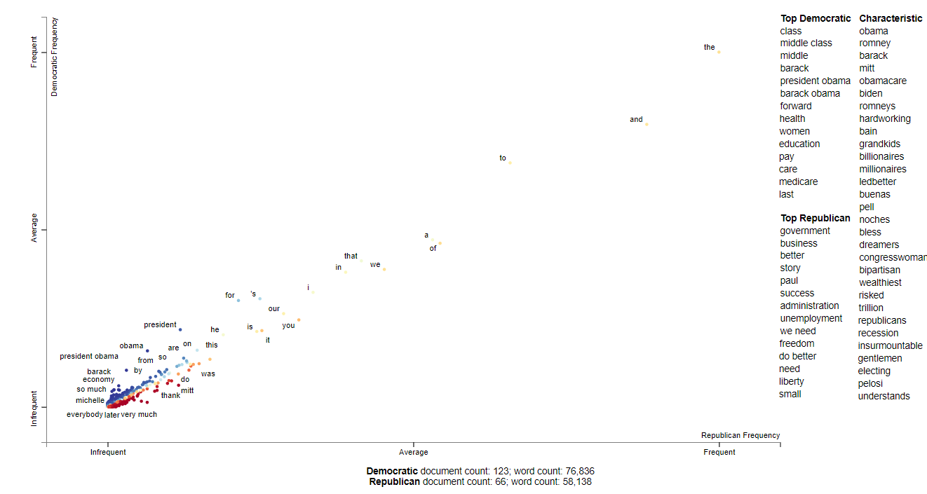
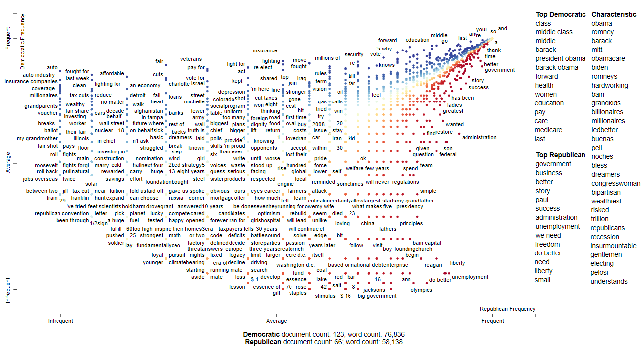
This shows the chracteristic terms used by candidates from both parties and which is more informative compared to the graph above
html = st.produce_scattertext_explorer(corpus,
                                       category='democrat',
                                       category_name='Democratic',
                                       not_category_name='Republican',
                                       minimum_term_frequency=5,
                                       width_in_pixels=1000,
                                       transform=st.Scalers.log_scale_standardize)
file_name = 'Scattertext-PyData/output/Conventions2012ScattertextLog.html'
open(file_name, 'wb').write(html.encode('utf-8'))
IFrame(src=file_name, width = 1200, height=700)
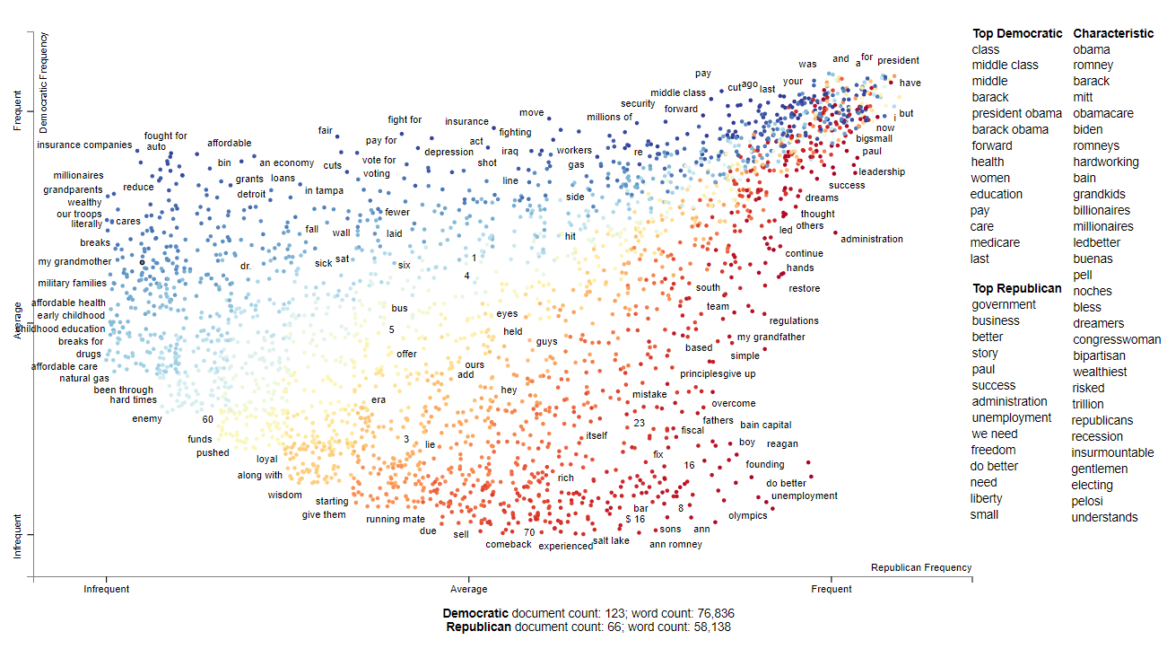
The follow visuals ranks each term by frequency percentile instead of raw frequencies
html = produce_scattertext_explorer(corpus,
                                    category='democrat',
                                    category_name='Democratic',
                                    not_category_name='Republican',
                                    width_in_pixels=1000,
                                    minimum_term_frequency=5,
                                    transform=st.Scalers.percentile,
                                    metadata=convention_df['speaker'])
file_name = 'Scattertext-PyData/output/Conventions2012ScattertextRankData.html'
open(file_name, 'wb').write(html.encode('utf-8'))
IFrame(src=file_name, width = 1200, height=700)
The next graph shows each term as randomly jitter points
Conclusion
You have seen how you can make good insight of your data using Scattertext in an easy and flexible without much of efforts. There are numerous other examples which can be found on their github page here. it provides a wide range of other ways to visualize your text data like Visualizing term association, Visualizing Empath topics and categories, Ordering Terms by Corpus Characteristictness, Document based scatter plots and many other advance usage of Text Data Visualization