Create Interactive Dashboard in Python using Streamlit
Dashboard gives a graphical interface to visualize the key indicators and trends of your data. However, Creating Dashboard is always been a tedious task for developers
They have to wear a Front-end Dev hat for creating a Web Dashboard. Switching gears from python to Javscript/HTML is not what all developers prefer to do.
There are libraries like Plotly Dash, Bokeh in Python which let you generate a dashboard using python and even some people convert a Jupyter notebook into a dashboard
Somehow I didn’t find all these options really an easy available options to create a dashboard in Python so my Search for easy to use and a user friendly Library in pure python continues and Finally I found something much easier way to do that.
Yes, Streamlit which is recently gaining popularity in the Machine Learning and Data science world is a super easy library which is around to develop a dashboard in almost no time
The good part is that it comes with an in-built web server too and can be easily deployed inside a docker container.
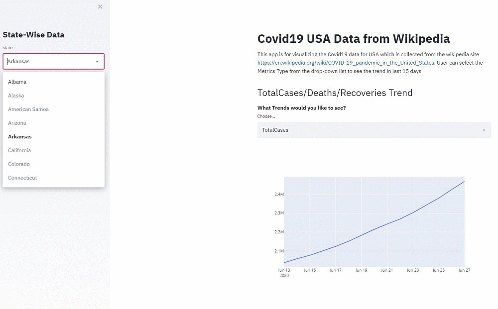
In this tutorial we will build a dashboard using COVID19 US Data. Here is the snapshot of the dashboard that you will see at the end of the tutorial
Collect data from Wikipedia
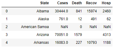
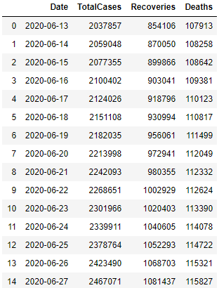
We will use the wikipedia data for this dashboard. Following are the two sets of data that you can download:
- Last 15 days data of Covid-19 Cases in the United States data from 19th June 2020 to 7th July 2020 at the time of writing this article
- COVID-19 pandemic in the United States by state and territory
We will download both these data in two csv files and rename as usa_covid_data_states.csv and usa_total_cases.csv
-
usa_covid_data_states.csv
-
usa_total_cases.csv
Installing Streamlit and Creating Dashboard
Streamlit can be installed using pip:
pip install streamlit
Now to start creating a dashboard let’s first create a simple python file main.py and import streamlit and add the Heading and paragraph at the dashboard start
We will also import pandas for reading the above two csv files created using the wikipedia data
import streamlit as st
import pandas as pd
Load the two files in the dataframe
csv_file_state = 'usa_covid_data.csv'
csv_file_total_cases = 'usa_total_cases.csv'
df= pd.read_csv(csv_file_total_cases,parse_dates=['Date'])
dfstate = pd.read_csv(csv_file_state)
Title and Markdowns
Streamlit has a number of ways to add text to your app. Let’s add a title out to Dashboard. We will also use markdown to add subtext or small paragraphs and write ups in our dashboard
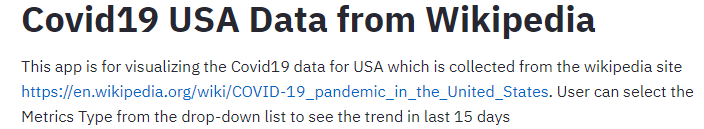
st.title("Covid19 USA Data from Wikipedia")
st.markdown(
"""
This app is for visualizing the Covid19 data for USA which is collected
from the wikipedia site https://en.wikipedia.org/wiki/COVID-19_pandemic_in_the_United_States.
User can select the Metrics Type from the drop-down list to see the trend in last 15 days
"""
)
Dropdowns in Streamlit
We will add a dropdown for user to select the following trend and plot
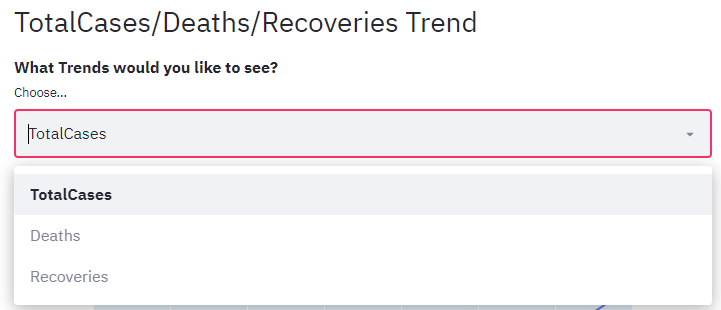
- Total Cases
- Deaths
- Recoveries
Use st.selectbox to choose from a series. You can write in the options you want, or pass through an array or data frame column.
st.markdown("## " + 'TotalCases/Deaths/Recoveries Trend')
st.markdown("#### " +"What Trends would you like to see?")

selected_metrics = st.selectbox(
    label="Choose...", options=['TotalCases','Deaths','Recoveries']
)
Plot Charts and Maps
Streamlit supports several popular data charting libraries like Matplotlib, Altair, Plotly etc.
We will use Plotly to draw charts for our dashboard
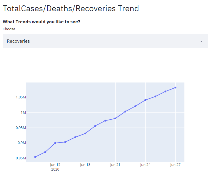
So we created the dropdown above and want to display the TotalCases/Deaths/Recoveries Trend based on user selection
We have directly use the dataframe columns as x and y data for adding traces based on user selection and You can easily add the chart to your app with st.plotly_chart()
# Create traces
fig = go.Figure()
if selected_metrics == 'TotalCases':
	fig.add_trace(go.Scatter(x=df.Date, y=df.TotalCases,
                    mode='lines',
                    name='TotalCases'))
if selected_metrics == 'Deaths':
	fig.add_trace(go.Scatter(x=df.Date, y=df.Deaths,
	                    mode='markers', name='Deaths'))
if selected_metrics == 'Recoveries':
	fig.add_trace(go.Scatter(x=df.Date, y=df.Recoveries,
	                    mode='lines+markers',
	                    name='Recoveries'))
st.plotly_chart(fig, use_container_width=True)
Similarly you can add other charts that you wanted to draw with this data.
Sidebar Widget
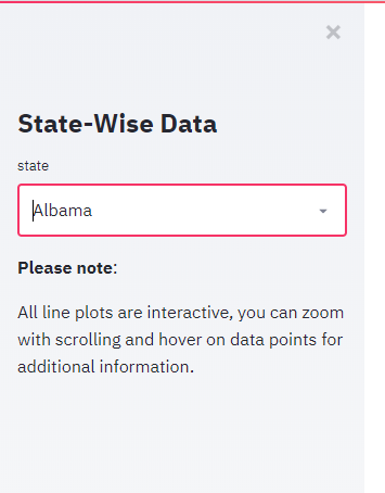
Another great feature of streamlit is a sidebar that gives a more cleaner look and keeps your app central and all widgets can be moved to the left of the page. Let’s see how to create a sidebar widget and dropdown filter for state using st.sidebar
st.sidebar.title("State-Wise Data")
State_list = st.sidebar.selectbox(
    'state',
     dfstate.State)
We have passed the state list(dfstate.state) as data for the dropdown options.
You can almost put all elements on the side bar like st.title(), st.markdown() etc.
Starting server and open dashboard in Browser
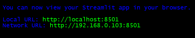
Open a terminal and navigate to the path where main.py is located and start the streamlit web server
streamlit run main.py
By default it will be running on port 8501. Open your browser and and hit this url http://localhost:8501 to see your dashboard in the browser
So with this we have completed the tutorial for creating a Covid19 US Dashboard using Streamlit. If you are looking for any customization to this dashboard then I will suggest to look at the official streamlit documentation
Deploy Streamlit App in Docker Container
We can also deploy the streamlit app inside a docker container. if there is any configuration related changes like changing the base url for the path then those changes can also be done in the docker file
Here is the Docker file which is in the same folder where main.py is located
FROM python:3.7

# exposing default port for streamlit
EXPOSE 8501

# making directory of app
WORKDIR /streamlit-docker

# copy over requirements
COPY requirements.txt ./requirements.txt

# installing required packages
RUN pip3 install -r requirements.txt

# copying all app files to image
COPY . .

# cmd to launch app when container is run
CMD streamlit run main.py

# streamlit-specific commands for config
ENV LC_ALL=C.UTF-8
ENV LANG=C.UTF-8
RUN mkdir -p /root/.streamlit
RUN bash -c 'echo -e "\
[general]\n\
email = \"\"\n\
" > /root/.streamlit/credentials.toml'

RUN bash -c 'echo -e "\
[server]\n\
baseUrlPath = \"coviddash\"\n\
" > /root/.streamlit/config.toml'
Next Run the following command to build a docker image and run the container
-
Build Docker Image
docker build -t coviddash .
-
Run Docker container
docker run coviddash
Conclusion
We have seen streamlit can be used to build a beautiful and interactive dashboards and web apps, all with zero web development experience! We have seen how to load, explore, visualize and interact with data, and generate dashboards in less than 100 lines of Python code
Eventually we can run this web app without using any external webserver since it has it’s own server powered by Tornado. It is easy to deploy in docker container too.
I think this is the fastest and easiest method to Visualize your Machine Learning Algorithm and create Dashbaord on the go option available right now for Python developers
You can find the complete code for this tutorial in my github repo here