Matplotlib add value labels on a bar chart using bar_label
We want to add the value labels in a bar chart, which is the value of each label on the top or center of a bar in a plot. We have bar_label() method in matplotlib to label a bar plot and it add labels to the bars in the given container. It takes five parameters:
- container - Container with all the bars and returned from bar or barh plots
- labels - list of labels that needs to be displayed on the bar
- fmt - format string for the label
- label_type - Either edge or center
- padding - Distance of label from the end of the bar
And it returns a list of text for the labels
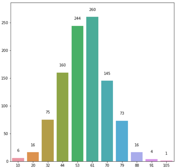
Here is an example of bar plot using bar_label to add labels on the top of the bar.
import numpy as np
import pandas as pd
import matplotlib.pyplot as plt
%matplotlib inline

Scores = [6, 16, 75, 160, 244, 260, 145, 73, 16, 4, 1]

score_series = pd.Series(Scores)

x_labels = [10, 20, 32, 44, 53, 61,
            70, 79, 88, 91, 105]

# Plot the figure.
plt.figure(figsize=(12, 8))
fig = score_series.plot(kind='bar')
fig.set_xticklabels(x_labels)
fig.bar_label(fig.containers[0], label_type='edge')
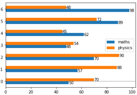
Another example for a horizontal group bar plot, we need to call bar_label() two times in this case since it’s a group bar chart with 2 bars in each group
maths = [50, 57, 70, 48, 62, 89, 98]
physics = [70, 88, 90, 54, 45, 72, 48]
# index = ['snail', 'pig', 'elephant','rabbit', 'giraffe', 'coyote', 'horse']
df = pd.DataFrame({'maths': maths,'physics': physics})
ax = df.plot.barh()
ax.axhline(0, color='grey', linewidth=0.8)
ax.bar_label(ax.containers[0])
ax.bar_label(ax.containers[1])
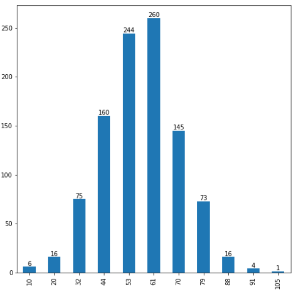
Padding parameter will pad the spacing between the values and the top of the bar
import seaborn as sns

import seaborn as sns

fig, ax = plt.subplots(figsize=(8, 8))
barchart = sns.barplot(x=x_labels, y=Scores, ax=ax)


barchart.bar_label(ax.containers[0], label_type='edge', padding=15)