How to change the date format and work with dates effectively in Matplotlib
We want to plot the data with date on x-axis but the dates are not in the required format for ex: your date column in the data is in YYYY-MM-DD format and you want to plot YYYY-MMM on the plot. The other issues with date plots are there are so many rows that the dates overlap each other and you don’t know if there is a concise way to plot the dates to make your plot meaningful.
matplotlib comes for a rescue and it provides convenience functions that can be used to change the date format or auto format the date and to set the major and minor locators on your axis.
Let’s create a dataset to work with, we will create a dataframe of dates and values. There are 50 rows in this data
dates = pd.date_range(start='2014, August', freq='M', periods=50)
df = pd.DataFrame({'date': dates, 'value': np.round(np.random.uniform(100,115,50),2)})
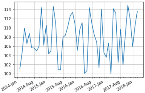
Default Date Formatter
We will plot this data with default format YYYY-MM(month is a decimal number in range(1,13)) and see how does the matplotlib default formatter works?
The matplotlib dates module provides the converter functions that converts the datetime and numpy datetime64 objects to and from Matplotlib’s internal representation, so the conversion happens automatically for the user,
However we will use autofmt_xdate that lets Date ticklabels not to overlap, so it is useful to rotate them and right align them
fig, ax = plt.subplots(1)
ax.grid(True)
fig.autofmt_xdate()
plt.plot(df['date'], df['value'])
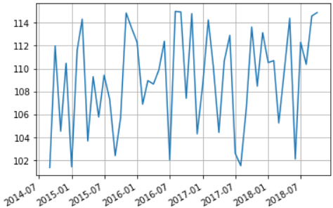
Set Major Formatter
Next we will set the date format of the major tickers on x-axis to YYYY-MMM(abbreviated month) by using set_major_formatter function, it accepts a Formatter instance of Matplotlib dates and following date formatters are accepted:
- AutoDateFormatter: It tries to figure out on it’s own the best date format
- ConciseDateFormatter: This makes the format as compact as possible while still having complete date information
- DateFormatter: This uses python strftime format strings.
fig, ax = plt.subplots(1)
ax.grid(True)
fig.autofmt_xdate()
datefmt = mdates.DateFormatter('%Y-%b')
ax.xaxis.set_major_formatter(datefmt)
plt.plot(df['date'], df['value'])
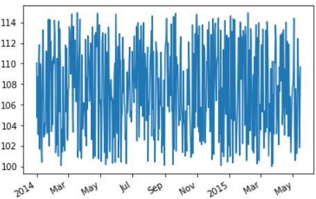
Concise Date Formatter
We will use the ConciseDateFormatter to make the format as compact as possible and which often removes the need to rotate the tick labels.
In this case we will use a larger data with 500 rows.
timeline = pd.date_range(start='2014, Jan', freq='D', periods=500)
df = pd.DataFrame({'date': timeline, 'value': np.round(np.random.uniform(100,115,500),2)})
fig, ax = plt.subplots(1)
fig.autofmt_xdate()
plt.plot(df['date'], df['value'])
ax.xaxis.set_major_formatter(mdates.ConciseDateFormatter(ax.xaxis.get_major_locator()))
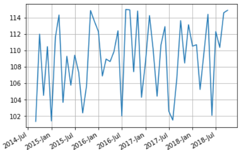
Set Major and Minor locator
We can also setup the major and minor locator of our date axes using the set_major_locator and set_minor_locator functions that takes an instance of Month locator and helps to make ticks on occurrences of each month defined in bymonth parameter. The default value of this parameter is range(1, 13), i.e. every month.
we will take our first data with 50 rows. This time we want only the 1st and 8th month i.e. January and August to be shown in the axis by setting the major and minor locators
# create dataframe
timeline = pd.date_range(start='2014, Jan', freq='M', periods=50)
df = pd.DataFrame({'date': timeline, 'value': np.round(np.random.uniform(100,115,50),2)})

# auto format the xdate
fig, ax = plt.subplots(1)
fig.autofmt_xdate()

# Change date format
datefmt = mdates.DateFormatter('%Y-%b')
ax.xaxis.set_major_formatter(datefmt)

# Set the Major locator for x-axis to month Jan and August
# and minor locator as month between these major locators
ax.xaxis.set_major_locator(mdates.MonthLocator(bymonth=(1, 8)))
ax.xaxis.set_minor_locator(mdates.MonthLocator())

plt.plot(df['date'], df['value'])