Dataframe Visualization with Pandas Plot
Visualization has always been challenging task but with the advent of dataframe plot() function it is quite easy to create decent looking plots with your dataframe, The **plot** method on Series and DataFrame is just a simple wrapper around Matplotlib plt.plot() and you really don’t have to write those long matplotlib codes for plotting.
In this post I will show you how to effectively use the pandas plot function and build plots and graphs with just one liners and will explore all the features and parameters of this function. I would be using the World Happiness index data of 2019 and you can download this data from the following link.
Download Link: World Happiness Data
Create Dataframe
Load the CSV file and just see how the data looks like
import pandas as pd
df=pd.read_csv('./world-happiness-report-2019.csv')
df.head(3)
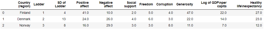
All the different columns in the dataframe, Some of these columns are verbose and I will rename to make them concise and more meaningful
df.rename(columns={"Country (region)": "Country", "Log of GDPnper capita": "Log_GDP_per_capita",
"Healthy lifenexpectancy":"Health_life_expect"},inplace=True)
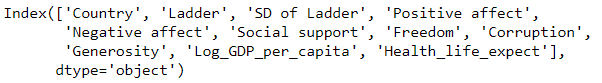
df.columns
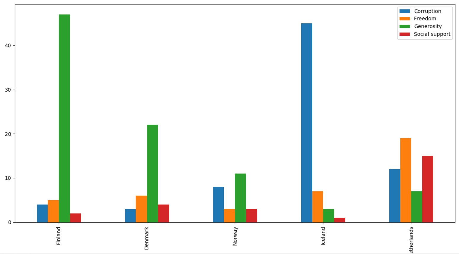
Pandas bar plot
Let’s start with a basic bar plot first. We will take Bar plot with multiple columns and before that change the matplotlib backend - it’s most useful to draw the plots in a separate window(using %matplotlib tk), so we’ll restart the kernel and use a GUI backend from here on out.
%matplotlib tk
df1=df[:5]
df1.plot('Country',['Corruption','Freedom','Generosity','Social support'],kind = 'bar')
Bar with positions
We can also give column positions instead of giving the columns name. Here we are giving y-axis column position as 7,6,8,5
%matplotlib tk
df1=df[:5]
df1.plot('Country',[7,6,8,5],kind = 'bar')
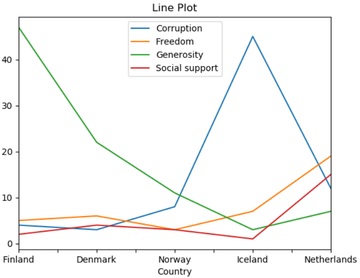
Pandas Line Chart
We are first selecting the first five rows from the dataframe and then plot Country as x-axis and other five columns - Corruption, Freedom, Generosity, Social support as y-axis and change the **kind** as line. The four columns are also shown in the legends box
df1=df[:5]
df1.plot('Country',['Corruption','Freedom','Generosity','Social support'],kind = 'line')
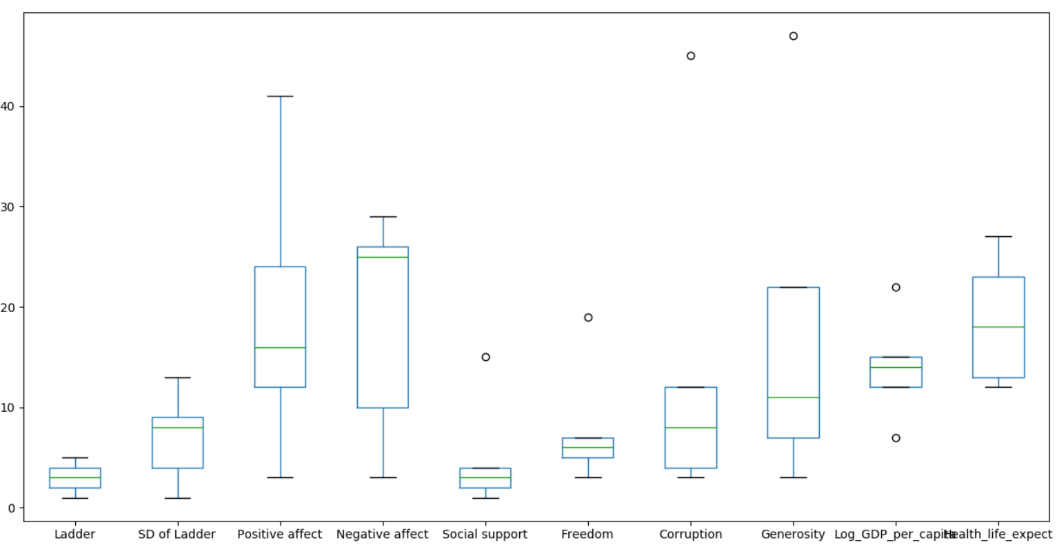
Pandas Box Plot
For the box plot, get the first five happiest country by slicing the dataframe as you can see in the code df[:5] and then use the plot function with **kind** box to draw the graph
df[:5].plot(x='Country',kind='box')
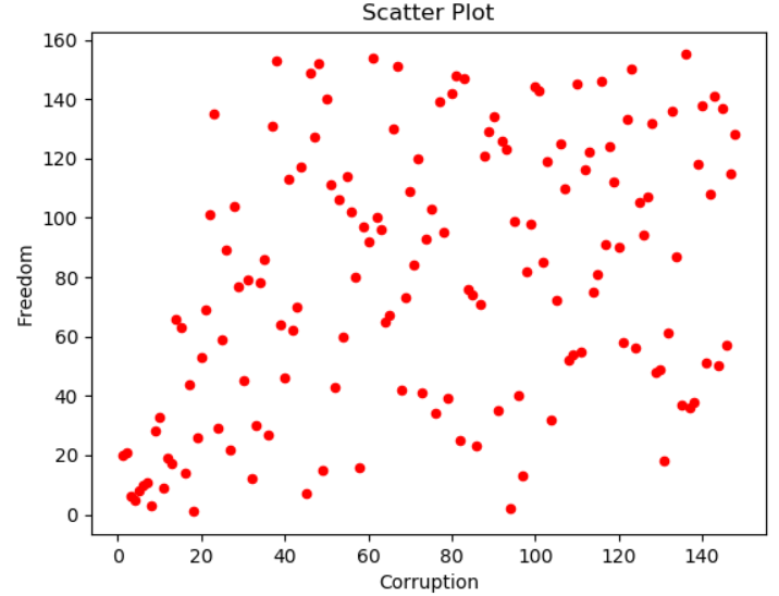
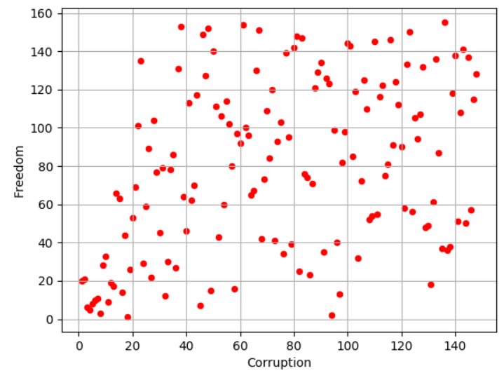
Pandas Scatter Plot
Pandas Scatter plot between column Freedom and Corruption, Just select the **kind** as scatter and color as red
df.plot(x='Corruption',y='Freedom',kind='scatter',color='R')
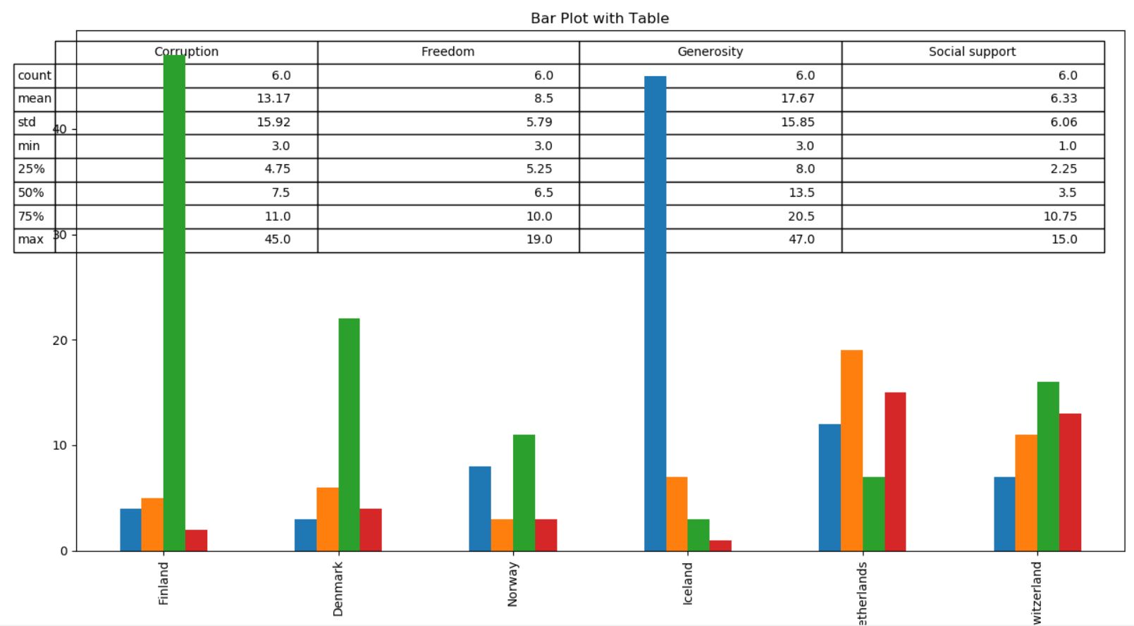
There also exists a helper function pandas.plotting.table, which creates a table from DataFrame or Series, and adds it to an matplotlib Axes instance. This function can accept keywords which the matplotlib table has.
from pandas.plotting import table
# df1=df[:5]
df1=df.loc[:5,['Country (region)','Corruption','Freedom','Generosity','Social support']]
ax=df1.plot('Country (region)',['Corruption','Freedom','Generosity','Social support'], kind = 'bar', title ='Bar Plot',
        legend=None)
table(ax, np.round(df1.describe(), 2),loc='upper right')
Pandas Plot set x and y range or xlims & ylims
Let’s see how we can use the xlim and ylim parameters to set the limit of x and y axis, in this line chart we want to set x limit from 0 to 20 and y limit from 0 to 100. First we are slicing the original dataframe to get first 20 happiest countries and then use **plot** function and select the **kind** as line and xlim from 0 to 20 and ylim from 0 to 100 as a **tuple**
df1=df[:20]
df1['Freedom'].plot(kind='line',xlim=(0,20),ylim=(0,100))
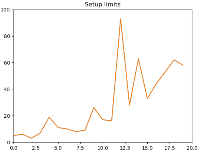
You can see the x-axis limits range from 0 to 20 and that of y-axis limit range from 0 to 100 as set in the plot function
Pandas plots x-ticks and y-ticks
Current ticks are not ideal because they do not show the interesting values and We’ll change them such that they show only these values. For x-axis I want 0,10,15 and 20 on the scale and similarly for y-axis I want 0,50,70,100 values on the scale. We will pass these values as **list** to **xticks** and yticks parameters.
df[:20]['Freedom'].plot(kind='line',xlim=(0,20),ylim=(0,100),color='red',xticks=([0,10,15,20]),yticks=([0,50,70,100])
                       title = 'xticks')
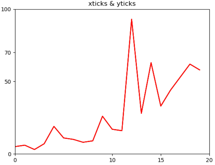
You can see the x-axis has the same value as passed to the xticks parameters and same for y-axis
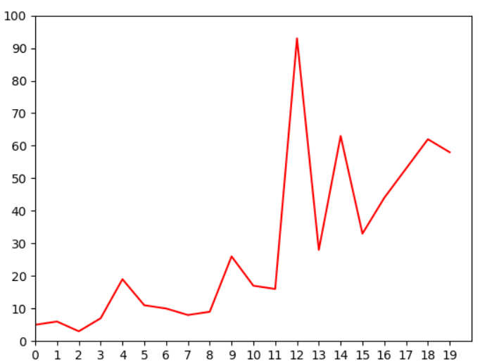
Current limits of the figure are a bit far and we want to see clearly see all the data points on the scale. So we get all the ticks with a distance of 1 in between for x-axis and distance of 10 in between two ticks for y-axis. Just check how we have setup a list comprehension to get these values. You can try to change some other values in the list and check how that looks like.
df[:20]['Freedom'].plot(kind='line',xlim=(0,20),ylim=(0,100),color='red',xticks=([w*1 for w in range(20)]),yticks=([w*10 for w in range(40)]))
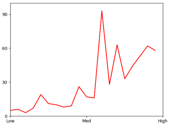
Text Labels on axis
So you don’t want to see the those numbers on the scale and instead you want to set the labels. That’s a good way to understand if your graphs are within the limits or exceeding the boundaries, so here we change the x-axis labels to text labels as Low, Medium and High
ax=df[:20]['Freedom'].plot(kind='line',xlim=(0,20),ylim=(0,100),color='red',xticks=([0,10,20]),
                        yticks=([w*30 for w in range(40)]))
ax.set_xticklabels(['Low','Med','High'])
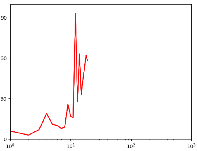
Log Scaling
This feature is useful when you are working with data with high range and setting up the integers on scale is not an option and you want to set the values like 10, 100, 1000 etc. logx and logy are the boolean parameters which when set to true will display the log scales on either or both axis
df[:20]['Freedom'].plot(kind='line',xlim=(0,1000),ylim=(0,100),color='red',logx=True)
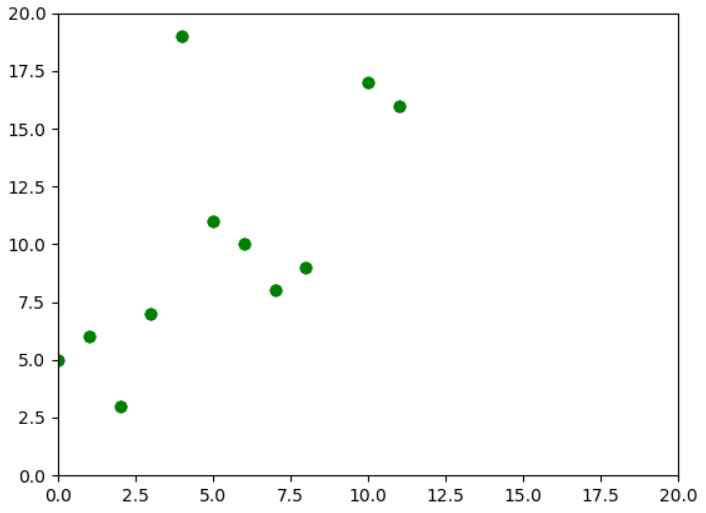
Pandas plot line style
We can also change the line style of the graphs using the style parameters, I am just using a green circle(style=’go’) to indicate all the data points on 2D graph. You can find the complete list of markers, line styles and colors in the matplotlib official documentation - Click this link and check under Notes section.
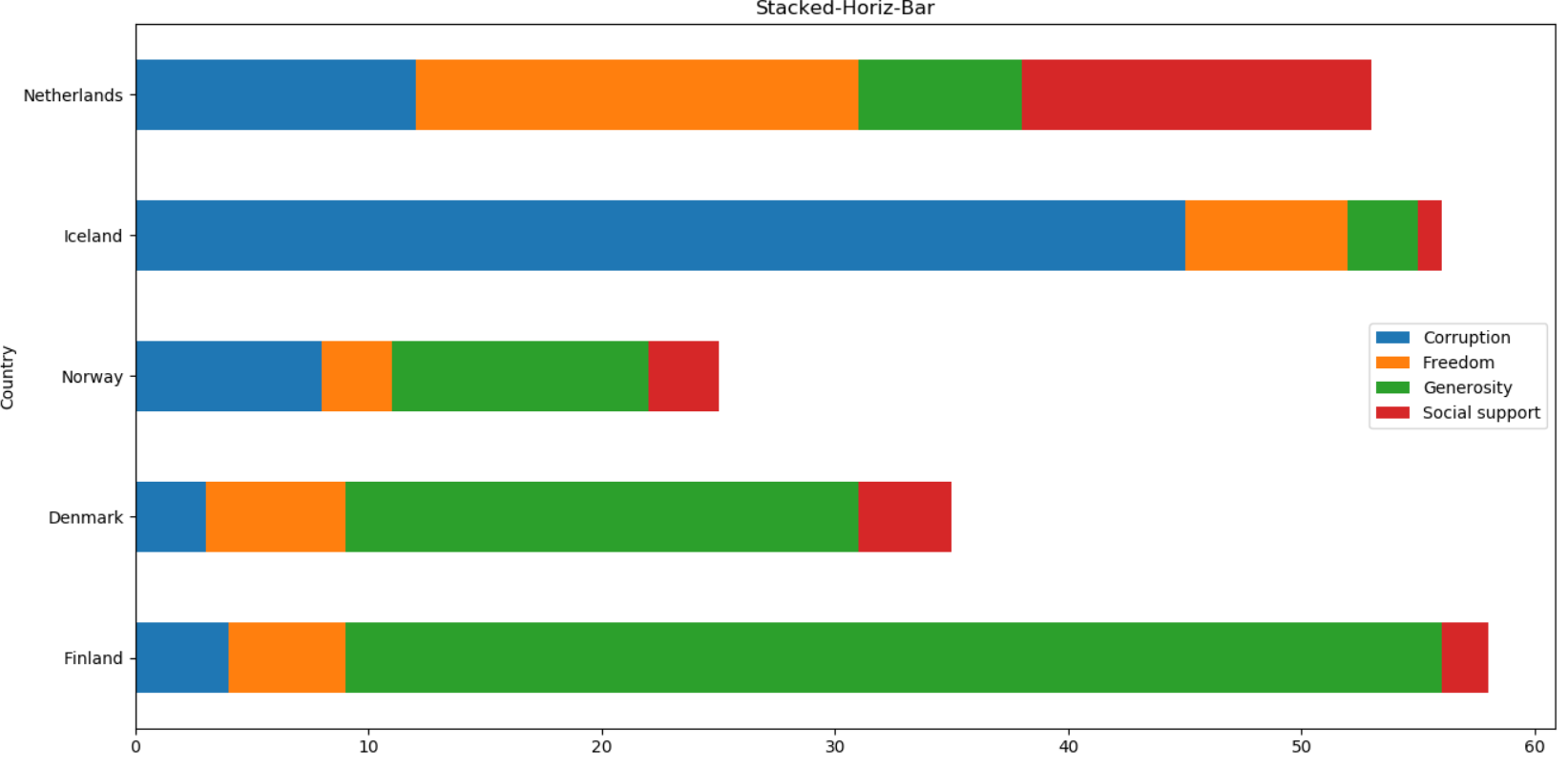
Pandas Stacked Bar
You can use stacked parameter to plot stack graph with Bar and Area plot
Here we are plotting a Stacked Horizontal Bar with stacked set as True
As a exercise, you can just remove the stacked parameter and see which graph is getting plotted
Pandas Grid Lines
So you want to see the axis grid lines then just set the grid parameter as True
df.plot(x='Corruption',y='Freedom',kind='scatter',color='R',grid=True)
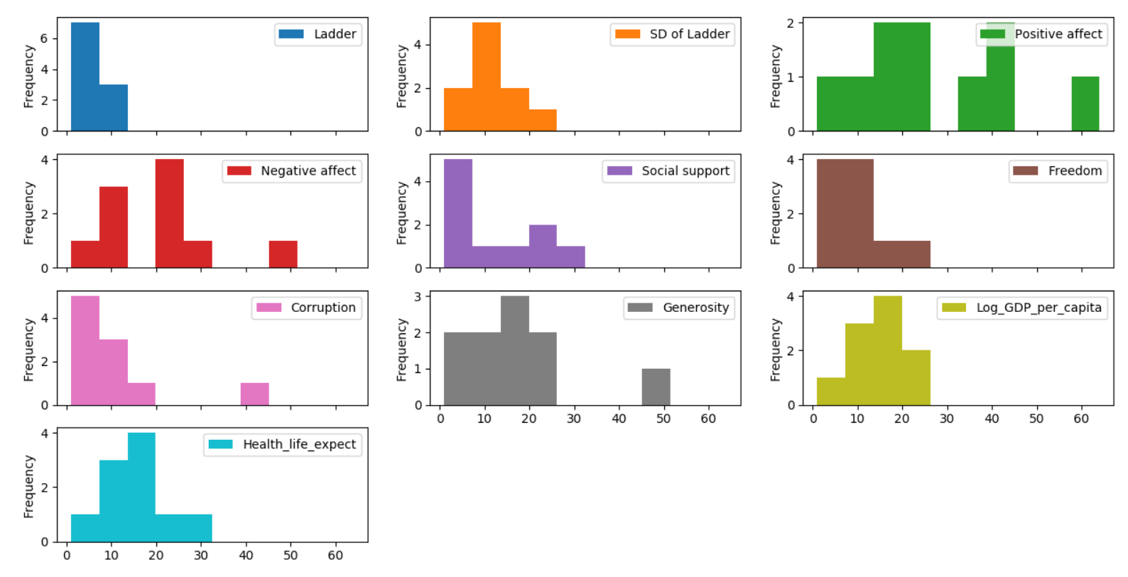
Pandas Subplots
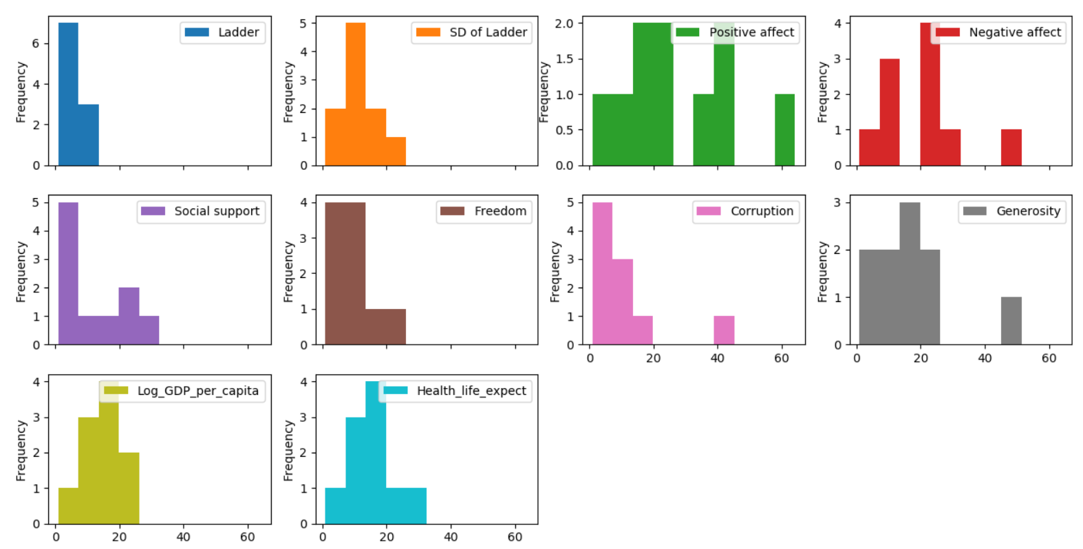
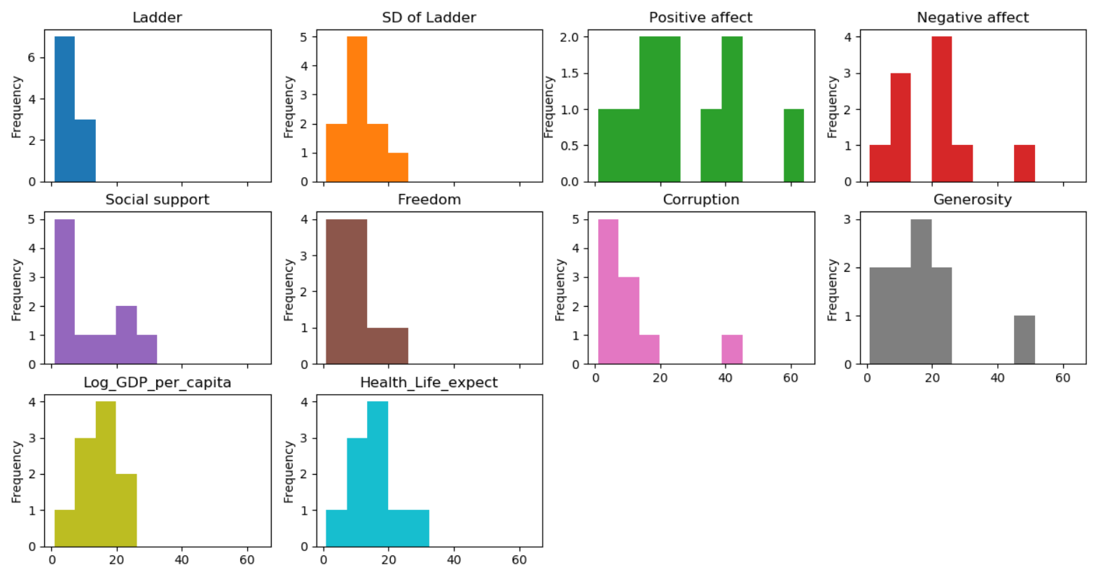
With **subplot** you can arrange plots in a regular grid. You need to specify the number of rows and columns and the number of the plot. Using layout parameter you can define the number of rows and columns. Here we are plotting the histograms for each of the column in dataframe for the first 10 rows(df[:10]). In the first figure below our layout is set as 4 rows and 3 columns and in the second figure the layout is set as 3 rows and 4 columns.
df[:10].plot(kind = 'hist',subplots=True, layout = (4,3))
4 rows and 3 columns
3 rows and 4 columns
Title above all subplots
In both the figures above we don’t have titles for the subplots. so we can pass the titles as list in the title parameter when the subplot is set as True
df[:10].plot(kind = 'hist',subplots=True, layout = (3,4) ,legend=False,title = ['Ladder','SD of Ladder','Positive affect','Negative affect','Social support','Freedom','Corruption','Generosity','Log_GDP_per_capita',
'Health_Life_expect'])
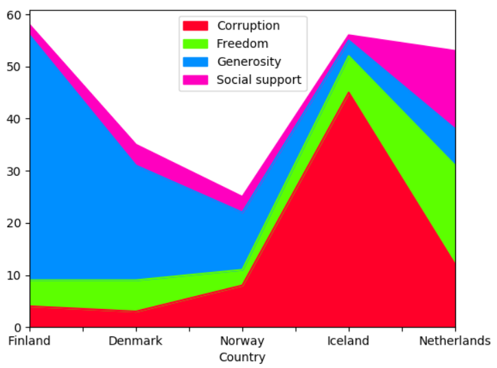
Pandas colormap
A potential issue when plotting a large number of columns is that it can be difficult to distinguish some series due to repetition in the default colors. To remedy this, DataFrame plotting supports the use of the colormap argument, which accepts either a Matplotlib colormap or a string that is a name of a colormap registered with Matplotlib
df1=df[:5]
df1.plot('Country',['Corruption','Freedom','Generosity','Social support'],kind = 'area',
        colormap='gist_rainbow')
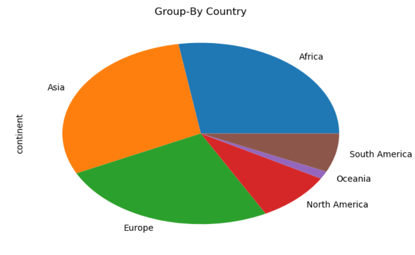
Pandas Plot Groupby count
You can also plot the groupby aggregate functions like count, sum, max, min etc. Here we are grouping on continents and count the number of countries within each continent in the dataframe using aggregate function and came up with the pie-chart as shown in the figure below
Note: In the original dataframe there is no column called continent, so I have mapped all the countries in the country column and created a new column called continent. You can check this link for the mapping between country and continents.
df.groupby('continent')['continent'].agg('count').plot(kind='pie',title='Group-By Country')
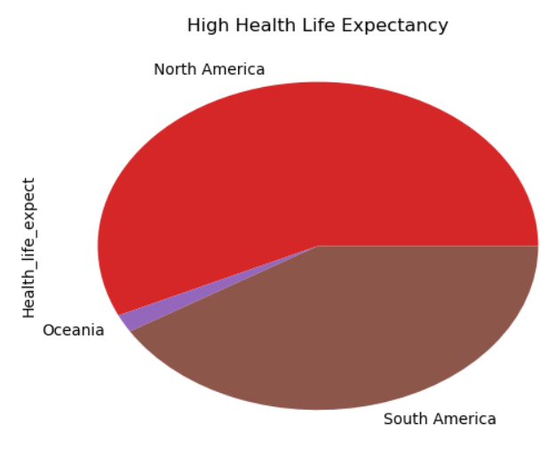
Pandas Groupby Plot Sum
For each continent calculate the sum of Health_Life_expect and plot that in a pie chart
df.groupby('continent')['Health_life_expect'].agg(lambda x: sum(x)).plot(kind='pie',title='High Health Life Expectancy')
Conclusion
Dataframe plot function which is a wrapper above matplotlib plot function gives you all the functionality and flexibility to plot a beautiful looking plots with your data. Only if you want some advanced plots which cannot be done using the plot function then you can switch to matplotlib or seaborn. You can use this exercise as an foundation to plot the data and just use some of other plot function parameters and see what you can come up with. You can share your findings or if you think I missed any of the critical features of this plot then please drop me a note in the comments section