How to create interactive data visualization using plotly
Visualization is the graphical representation of your data and it let you paint your data into a canvas in a way you want to see it. There are lot of amazing libraries and tools available in the market to plot your data without much of effort
However being a Data Scientist, I mostly work on Python and always looking around the amazing open source tools developed by those amazing peoples and leveraging their power in my work
In my previous post about Data Visualization, I explained how flexible is the Pandas plot function which is a wrapper of matplotlib and can be used with much ease to give a graphical shape to your data in no time.
Recently, I used plotly for some visualization work and found it to be a great tool for visualizing your data and gives a quick turnaround
What is plotly?
Its a graphing library that lets you create an interactive graphs on your browser using python and You can also view it on a jupyter notebook or a HTML file
Installation
As of writing this post 4.4.1 is the latest stable version of plotly
Install it using pip command:
pip install plotly==4.4.1
you can read more about installing using conda and jupyter notebook support in this link
Getting Started
I am using the World Happiness index data of 2019 to plot different graphs type and to explore plotly functions.
You can download this data from the following link
Download Link: World Happiness Data
Create Dataframe
We will first create a dataframe of downloaded data because we will be using this dataframe for plotting in the following sections
import pandas as pd
df=pd.read_csv('./world-happiness-report-2019.csv')
df.head(3)

Rename Columns:
The original column names are long therefore we will rename those columns to something meaningful
df.rename(columns={"Country (region)": "Country", "Log of GDPnper capita": "Log_GDP_per_capita",
                  "Healthy lifenexpectancy":"Health_life_expect"},inplace=True)
Plotly Bar Chart
Let’s start with a basic bar plot first.
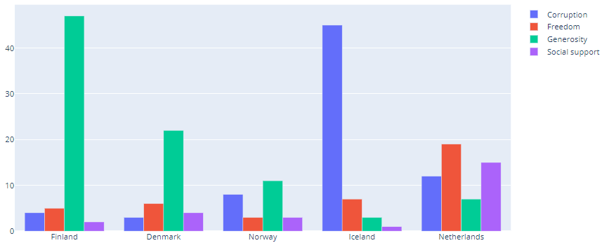
We will plot the columns in group for the top 5 happiest country and will display them side-by-side
We are creating an array of top 5 happiest country and then adding plotly graph object Bar for each of the columns in a data array
The argument x is the array of country and argument y is the pandas series object of each of the column
You can also create this data array using a for loop
Finally we will update the layout of the figure and pass the barmode parameter as group to create a grouped bar graph
import plotly as pt
import plotly.graph_objs as go
country =df[:5]['Country']

fig = go.Figure(data=[
    go.Bar(name='Corruption', x=country, y=df[:5]['Corruption']),
    go.Bar(name='Freedom', x=country, y=df[:5]['Freedom']),
    go.Bar(name='Generosity', x=country, y=df[:5]['Generosity']),
     go.Bar(name='Social support', x=country, y=df[:5]['Social support'])
])

# Change the bar mode
fig.layout.update(barmode='group')
fig
Line chart
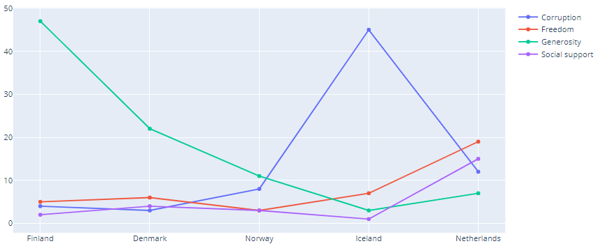
We are first selecting the first five rows from the dataframe to get the top five happiest country and then plot Country as x-axis and other five columns – Corruption, Freedom, Generosity, Social support as y-axis
Finally changing the plotly graph object to Line.
The four columns are also shown in the legends box
import plotly as pt
import plotly.graph_objs as go
country =df[:5]['Country']

fig = go.Figure(data=[
    go.Line(name='Corruption', x=country, y=df[:5]['Corruption']),
    go.Line(name='Freedom', x=country, y=df[:5]['Freedom']),
    go.Line(name='Generosity', x=country, y=df[:5]['Generosity']),
     go.Line(name='Social support', x=country, y=df[:5]['Social support'])
])

# Change the bar mode
fig.layout.update(barmode='group')
fig.show()
add_trace and Box Plot
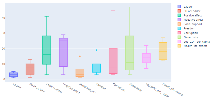
We will plot the box graph now and this time we will update the figure object using the add_trace() method
New traces can be added to a graph object figure using the add_trace method.
This method accepts a graph object trace (an instance of go.Scatter, go.Bar, etc.) and adds it to the figure.
This allows you to start with an empty figure, and add traces to it sequentially
import plotly.graph_objects as go
import numpy as np

fig = go.Figure()
for items in df.columns[1:]:
    fig.add_trace(go.Box(y=df[:5][items],name = items ))
fig.show()
Scatter Plot
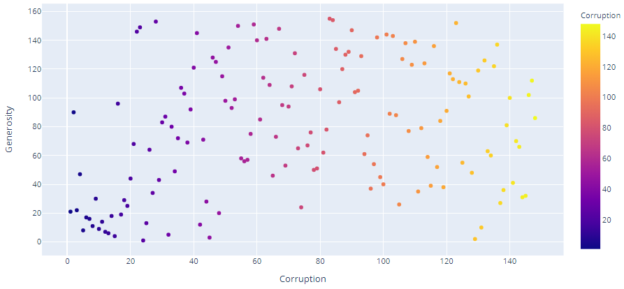
We will create the scatter plot using Plotly Express which is easy-to-use, high-level interface to Plotly
With px.scatter, each data point is represented as a marker point, which location is given by the x and y columns
The color data is added to hover information. You can add other columns to hover data with the hover_data argument of px.scatter
import plotly.express as px
fig = px.scatter(df,x= "Corruption",y= "Generosity",color='Corruption')
fig.show()
Plotly express Scatter Matrix
As per the definition in official plotly documentation:
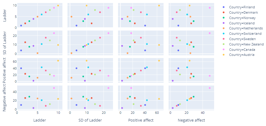
A scatterplot matrix is a matrix associated to n numerical arrays (data variables), X1,X2,…,XnX1,X2,…,Xn , of the same length. The cell (i,j) of such a matrix displays the scatter plot of the variable Xi versus Xj.
We are using the plotly express scatter_matrix function to plot the first four columns of the dataframe excluding Country column
We can specify the columns to be displayed in the dimensions parameter and represent color using any of the column
fig = px.scatter_matrix(df[:10], dimensions=df.columns[1:5], color="Country")
fig.show()
Plotly X and Y axis Range
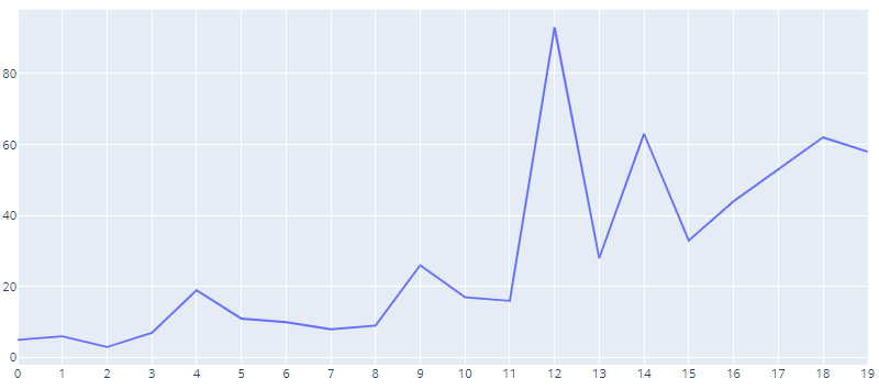
In this below line chart we will set x limit from 0 to 20 and y limit from 0 to 100
we are slicing the original dataframe(df[:20]) to get first 20 happiest countries and
then use **Line** function with X-axis set as numpy ndarray with range of 100 and Y-axis set as Array of Freedom column for first top 20 highest country
We are updating the figure x axis and y axis by setting the start value of the axes and the interval
So for x-axis the start value is 0 and interval is 1 and for y-axis the start value is 0 and interval is 20 and that is evident from the plot below
fig = go.Figure(data=[
    go.Line(x=np.arange(101),y=df[:20]['Freedom'])])

# Change the bar mode
fig.update_yaxes(tick0=0, dtick=20)
fig.update_xaxes(tick0=0, dtick=1)
fig.show()
Plotly tickvals
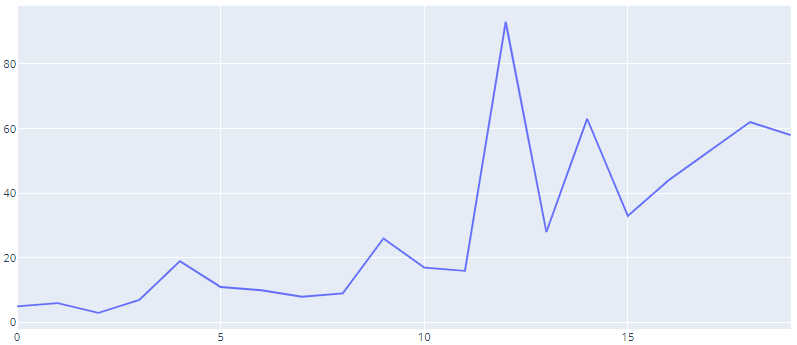
You can also set your own tick value array and pass it to tickvals parameter
Because we are passing [0,5,10,15,20] array to the tickvals argument in the update_xaxes() function the plot shows the same values for the x-axis
fig = go.Figure(data=[
    go.Line(x=np.arange(101),y=df[:20]['Freedom'])])

# Change the bar mode
fig.update_yaxes(tick0=0, dtick=20)
fig.update_xaxes(tickvals=[0,5,10,15,20])
fig.show()
Plotly axis tick labels
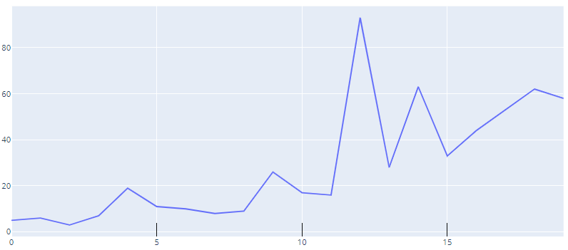
We can also customize the tick marks in the plot by setting the tick width, color and length arguments in update functions
fig = go.Figure(data=[
    go.Line(x=np.arange(101),y=df[:20]['Freedom'])])

# Change the bar mode
fig.update_yaxes(tick0=0, dtick=20)
fig.update_xaxes(tickvals=[0,5,10,15,20],ticks="inside", tickwidth=1, tickcolor='black', ticklen=20)
fig.show()
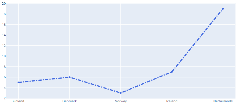
add_trace and line style
We can also style the line plots like color and dash of the traces, adds trace names, modifies line width, and adds plot and axes titles
So here we are just updating the line as dashdot, Beside you can also set it as dash or dot and set the width and color of the line by passing the dict in line argument
fig = go.Figure()
fig.add_trace(go.Scatter(x=df[:5]['Country'], y=df[:5]['Freedom'], name='High 2014',line=dict(color='royalblue', width=4,dash='dashdot')))

fig.show()
Update Layout
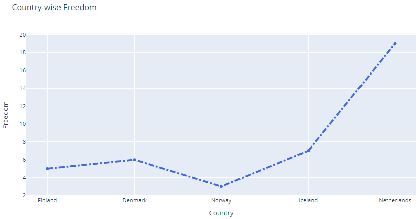
We can update the layout by giving a title to the plot and naming it’s x-axis and y-axis because that gives more info about your chart and it’s axes
fig = go.Figure()
fig.add_trace(go.Scatter(x=df[:5]['Country'], y=df[:5]['Freedom'], name='High 2014',
                         line=dict(color='royalblue', width=4,dash='dashdot'))) ## dash options include 'dash', 'dot', and 'dashdot'

fig.update_layout(title='Country-wise Freedom',
                   xaxis_title='Country',
                   yaxis_title='Freedom')
fig.show()
Line Shape
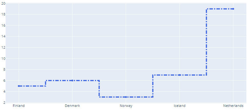
Because in the above line chart you have not set the line_shape argument so by default it was linear
However if you want to select some other shape for the lines then select from the following options: linear, spline, vhv, hvh,vh, hv
We have selected a line_shape hvh here
fig = go.Figure()
fig.add_trace(go.Scatter(x=df[:5]['Country'], y=df[:5]['Freedom'], name='High 2014',
                         line=dict(color='royalblue', width=4,dash='dashdot'),line_shape='hvh')) ## dash options include 'dash', 'dot', and 'dashdot'

fig.show()
Stacked Bar
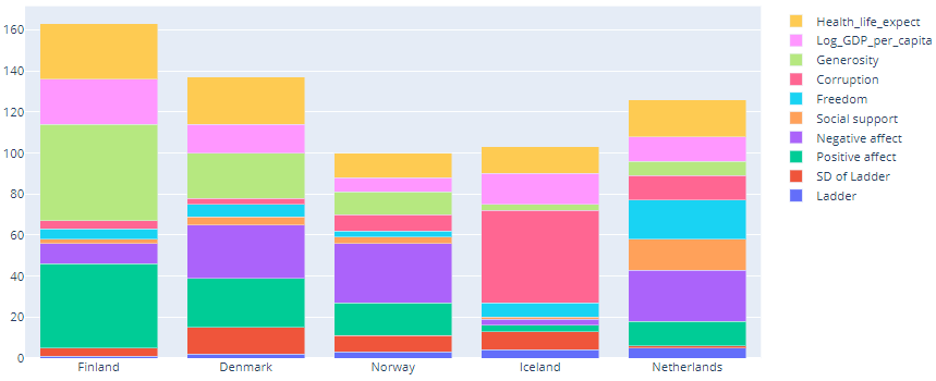
We will create the stacked bar containing all the columns of top 5 happiest country
Just make sure to change the barmode argument to stack
country=df[:5]['Country']
data = []

for items in df.columns[1:]:
    data.append(go.Bar(name=items, x=country, y=df[:5][items]))


fig = go.Figure(data=data)
# Change the bar mode
fig.update_layout(barmode='stack')
fig.show()
Grid Lines
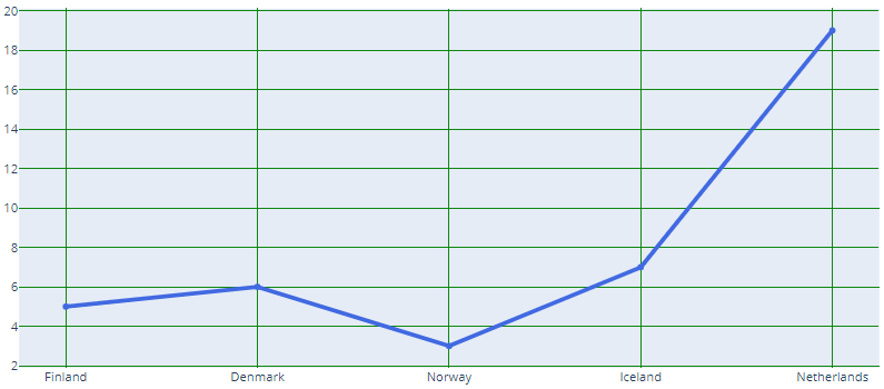
So you want to see the axis grid lines because that gives a more feel about the scales in plot
So, update the axes and set the showgrid argument as True and beside that set other arguments like gridwidth and gridcolor
fig = go.Figure()
fig.add_trace(go.Scatter(x=df[:5]['Country'], y=df[:5]['Freedom'], name='High 2014',
                         line=dict(color='royalblue', width=4)))

fig.update_xaxes(showgrid=True, gridwidth=1, gridcolor='Green')
fig.update_yaxes(showgrid=True, gridwidth=1, gridcolor='Green')
fig.show()
Plotly Sub Plots
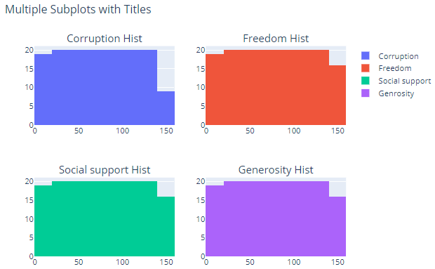
With **subplot** you can arrange plots in a regular grid.
You need to specify the position by setting the row and column number for each of the plot
In the below subplot we are creating the histogram of four columns
from plotly.subplots import make_subplots
import plotly.graph_objects as go

fig = make_subplots(
    rows=2, cols=2,
    subplot_titles=("Corruption Hist", "Freedom Hist", "Social support Hist", "Generosity Hist"))


fig.add_trace(go.Histogram(x=df['Corruption'],name='Corruption'),
              row=1, col=1)

fig.add_trace(go.Histogram(x=df['Freedom'],name='Freedom'),
              row=1, col=2)

fig.add_trace(go.Histogram(x=df['Social support'],name='Social support'),
              row=2, col=1)

fig.add_trace(go.Histogram(x=df['Generosity'],name='Generosity'),
              row=2, col=2)

fig.update_layout(height=500, width=700,
                  title_text="Multiple Subplots with Titles")

fig.show()
Conclusion
In this post we have seen how plotly can be used easily to visualize your data and create an eye catching plots in no time.
Most Importantly, We have learnt to create different types of plots - Bar, Scatter, Stacked bar and Line. Additionally we’ve seen how to customize the layout and make your graphs beautiful by changing the color and scale.
With plotly you can also set the line and it’s properties and create subplots with different columns of your data