Time Series Analysis and Forecasting with ARIMA
In the previous post we have seen how to visualize a time series data. In this post we will discuss how to do a time series modelling using ARMA and ARIMA models. Here AR stands for Auto-Regressive and MA stands for Moving Average
Before we start discussing the ARIMA models, we should know the stationarity of time series
Stationary Process
A time series is called to be stationary if there is no change in mean, variance and covariance of the observations over a period of time.
The process remains in a state of statistical equilibrium
In other words a process is said to be stationary if the joint distribution of observations does not change and remain same when the origin of time is shifted by amount k
This means that the mean and variance are constant and do not depend on time. There are two types of stationary processes: Strict & Weak Stationary Process
Stationary Process
Non Stationary Process

What is ARIMA?
ARIMA stands for Auto-Regressive Integrated Moving Average and it’s one of the widely used time series models for forecasting
It also accounts for the pattern of growth/decline in the data or noise between consecutive time points
ARIMA are applied to data that shows Non-Stationarity and difference of successive observations are taken to eliminate the non-stationarity. Sometimes more than one difference of successive observation is required to get a modified stationary model
That’s the reason it is called as an Integrated model because the stationary model that is fitted to the modified series has to be summed or integrated to provide a model for the original non-stationary series
ARIMA Modelling Procedure
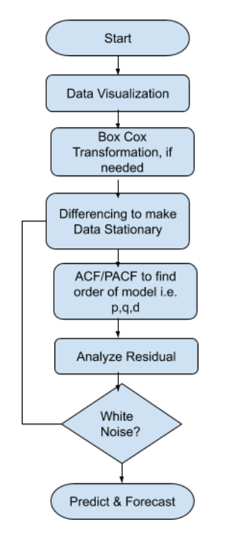
We should be fitting the ARIMA model to a Stationary and non-seasonal time series data and follow the procedure described in the above flow chart
- First thing is you should plot the data to find hidden patterns, trends and other behavior
- Decompose the data to know the underlying Trend and Seasonality in the data
- To stabilize and normalize the data you can use the Box-Cox transformation. It is a way to transform data that ordinarily do not follow a normal distribution
- Plot ACF/PACF to determine the order for the ARIMA model i.e. p,d and q values. Alternatively, you can also use AICc and BICc to determine the p,q,d values. Choose the one where AICc and BICc is lowest
- Verify the Residuals and ensure it looks like white noise otherwise try a modified model with different values of p,q and d. Remember Residuals which are white noise can do a forecast
Let’s get Started
Load Dataset
We will be using the Monthly Temperature datatset of Armori City. You can download it from this link
import pandas as pd
import statsmodels.api as sm
import matplotlib.pyplot as plt
import seaborn as sns
sns.set(rc={'figure.figsize':(15,6)})
%matplotlib inline
df = pd.read\_csv('./monthly_temperature_aomori_city.csv')
df['DATE'] = pd.to_datetime(df[['year', 'month']].assign(DAY=1))
df.drop(['year','month'],inplace=True,axis=1)
df['temperature'] = df['temperature']*(9/5)+32
df.set_index('DATE',inplace=True)
df.to_csv('./monthly_temperature_aomori_city_updt.csv',index=True)
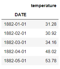
df.head()
Basic Analysis and Data Visualization
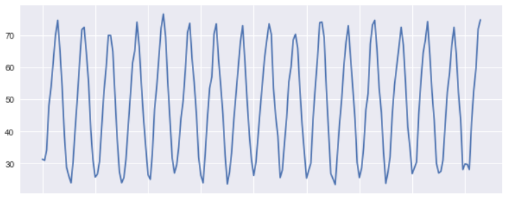
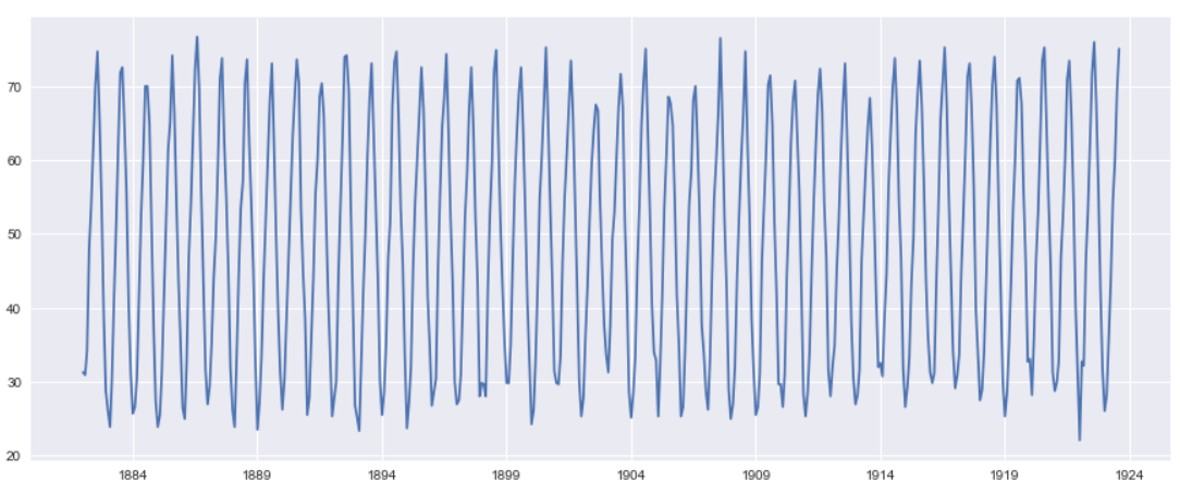
Let’s draw a simple line plot for first 200 rows to understand the pattern in the data and how the temperature is trending. It looks like that a Cyclic pattern is followed here
plt.figure(figsize=(10,4))
plt.plot(df[:200].temperature)
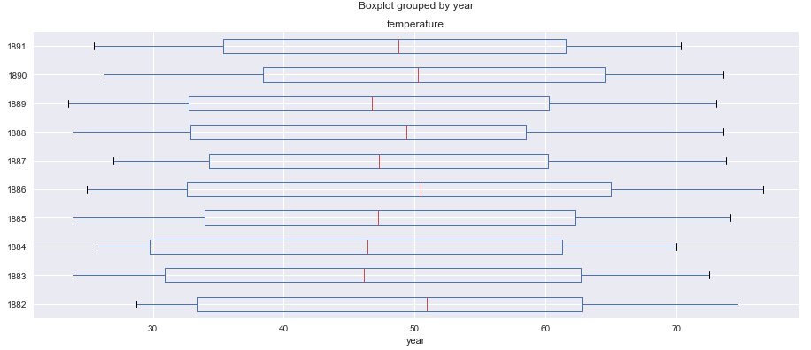
We will draw a Box and Whisker plot for first 5 years to understand the data distribution and get a quick five point summary for the data
df[:120].boxplot(figsize=(15,6),by='year',column='temperature',vert=False)
If you are looking for in-depth tutorial on Time Series Analysis and Visualization you can check this blog, which is part 1 of this time series analysis blogs
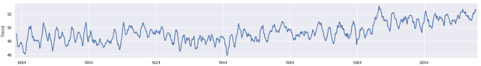
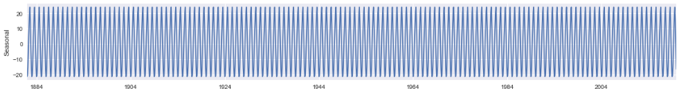
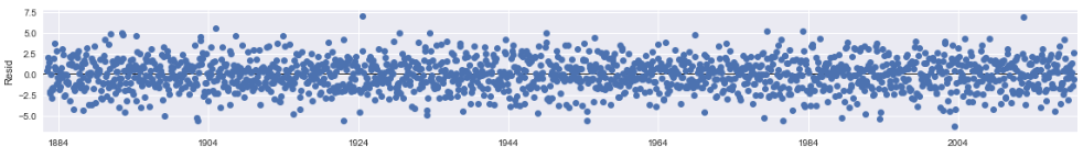
Data Decomposition
To further analyze the time series data, Decomposition helps to remove the seasonality from the data.
Basically Decomposition has three components that is shown in the graphs below i.e Trend, Seasonality and Residual
You have to choose a model type also additive or multiplicative. We have taken an additive model because the seasonality doesn’t varies much from start to end of the years
decomposition = sm.tsa.seasonal_decompose(df.temperature, model='additive')
plt.rcParams["figure.figsize"] = [16,9]
fig = decomposition.plot()
Trend
Seasonality
Residual
Check Stationarity
ARIMA model works better on a Non-Stationary data and the first thing that we should be checking is the Stationarity of the data. The Augmented Dickey-Fuller test can be used to test the null hypothesis that the series is non-stationary
The ADF test helps to understand whether a change in Y is a linear trend or not. If there is a linear trend but the lagged value cannot explain the change in Y over time, then our data will be deemed non-stationary
from statsmodels.tsa.stattools import adfuller
def check_stationarity(timeseries):
    result = adfuller(timeseries,autolag='AIC')
    dfoutput = pd.Series(result[0:4], index=['Test Statistic','p-value','#Lags Used','Number of Observations Used'])
    print('The test statistic: %f' % result[0])
    print('p-value: %f' % result[1])
    print('Critical Values:')
    for key, value in result[4].items():
        print('%s: %.3f' % (key, value))
check_stationarity(df.temperature)
The value of test statistics is less than 5% critical value and p-value is also less than 0.05 so we can reject the null hypothesis and Alternate Hypothesis that time series is Stationary seems to be true
The test statistic: -2.936397 p-value: 0.041276 Critical Values: 1%: -3.434 5%: -2.863 10%: -2.568
There is nothing unusual about the time plot and there appears to be no need to do any data adjustments. There is no evidence of changing variance also so we will not do a Box-Cox transformation.
How to determine AR(p),MA(q) and I(d) values for ARIMA model?
So what does model order of ARIMA(2,1,3) means? It means 2nd order Auto-Regressive (AR) and 3rd order Moving Average (MA). You can think it as ARIMA( AR(p), I(d), MA(q))
So the d is Integrated I(d) part that is decided based on number of times you have to do a data difference to make it stationary. We will learn more about it in the next section
What is the best way to select the value of p,q and d?
- For Moving Average order i.e. q you have to look at the Auto Correlation Factor(ACF) graph. You need some experience to keenly look at the graphs and significant lags and corresponding Correlations to determine the value
- Similarly for the Auto-Regressive order i.e. p you have to look at the partial correlation factor (pacf) graph
- Another Alternate way is to find the set of models with the lowest AIC values Akaike’s Information Criterion
- For determining AIC you have to fit the model with different combination of p,q and d and look for the lowest AIC value
Differencing Data to achieve Stationarity. Also Determine value of d
Our Data is stationary but just to showcase how data differencing works we will assume that our Time Series data is not Stationary
We will also do a log transform of the original data to make the seasonality same throughout the data
import numpy as np
ts_temp_log = np.log(df)
ts_temp_log
So Basically you have to subtract the value with their previous value to get the difference in data. We will use numpy.diff() function to achieve that
ts_temp_log_diff = np.diff(ts_temp_log.temperature)

plt.plot(ts_temp_log_diff)
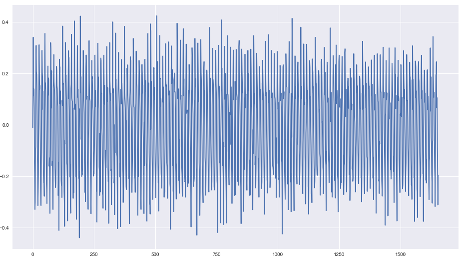
The differenced data looks stationary so we don’t have to go for any further differencing
Again, After our first data differencing we will check the stationarity of data using the ADF test.
This time the p-value is 0 which is very good and the test statistics is also less than the 5% critical
check_stationarity(ts_temp_log_diff)
The test statistic: -15.725118
p-value: 0.000000
Critical Values:
	1%: -3.434
	5%: -2.863
	10%: -2.568
The value of d will be 1 because we have done the data difference one time to achieve stationarity
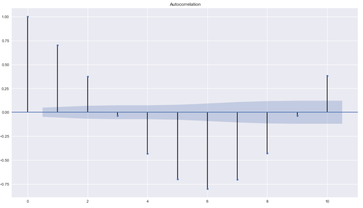
Determine P and Q value from ACF and PACF plot
Once our data is set to stationary then the next task is to determine the appropriate value of ARIMA model i.e. p and q
We can learn some important properties of our time series data with the help of Auto Correlation(ACF) and Partial Auto Correlation (PACF) graphs.
This provide useful descriptive properties for understanding which model can be used for time series forecasting
ACF measures the linear relationships between observations at different time lags.
In other words, ACF is used to understand if there exists a correlation between a time series data point with another point as a function of their time difference
The Partial Auto Correlation factor(PACF) is the partial correlation between the two points at a specific lag of time.
Plotting the partial autocorrelative functions one could determine the appropriate lags p in an AR (p) model or in an extended ARIMA (p,d,q) model
from statsmodels.graphics.tsaplots import plot_acf
plot_acf(ts_temp_log_diff,lags=10)
from statsmodels.graphics.tsaplots import plot_pacf
plt.figure(figsize=(10,2))
plot_pacf(ts_temp_log_diff,lags=10)
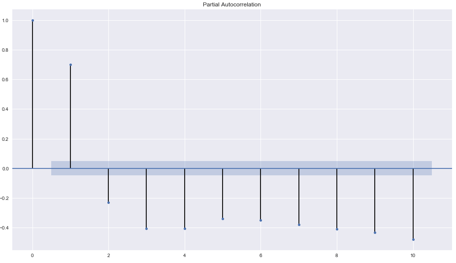
From the PACF plot we can see a significant correlation at lag of 2. So the PACF suggests an AR(2) model. So an inital order for the model will be (2,0,3)
Remember our d value is 0 because our data was stationary before differencing.
Alternatively, you can also use auto arima to find the appropriate value of p,q and d
AUTO ARIMA
So if you want to know the value of p,q and d without much of pain then use Auto arima.
It’s a python library inspired from the auto arima package in R which is used to find the best fit ARIMA model for the univariate time series data
import pyramid as pm
auto_arima_fit = pm.auto_arima(df, start_p=1, start_q=1,
                             max_p=3, max_q=3, m=12,
                             start_P=0, seasonal=True,
                             d=1, D=1, trace=True,
                             error_action='ignore',
                             suppress_warnings=True,
                             stepwise=True)
Fit ARIMA: order=(1, 1, 1) seasonal_order=(0, 1, 1, 12); AIC=7044.189, BIC=7071.210, Fit time=29.769 seconds
Fit ARIMA: order=(0, 1, 0) seasonal_order=(0, 1, 0, 12); AIC=8721.729, BIC=8732.538, Fit time=0.218 seconds
Fit ARIMA: order=(1, 1, 0) seasonal_order=(1, 1, 0, 12); AIC=8072.542, BIC=8094.159, Fit time=5.261 seconds
This will help to choose the best value of p,q and d based on the lowest AIC and BIC values
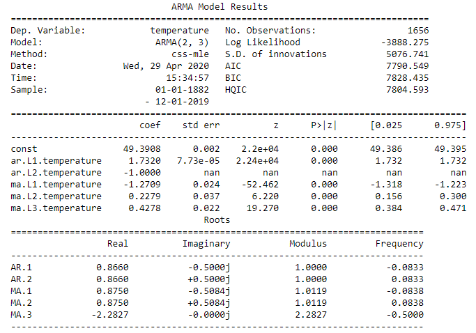
Fit an ARIMA model
Now we have to fit our data to the ARIMA using the order of model (2,0,3) determined above using ACF and PACF plot.
This sets the lag value to 2 for autoregression AR(2) and uses a data difference order of 0 since our time series is stationary, and uses a moving average model of 3.
from statsmodels.tsa.arima_model import ARIMA
mod = ARIMA(df.temperature,order=(2,0,3))
results = mod.fit()
print(results.summary())
Residuals Diagnosis
A model residuals is difference between the predicted and expected value and can be verified using the fitted model property resid().
Residual object is of type ndarray so we will store it in a Dataframe for plotting
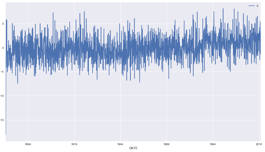
In the below line plot we don’t see any large residuals and all of them are within their upper and lower limits
residuals = pd.DataFrame(results.resid)
residuals.plot()
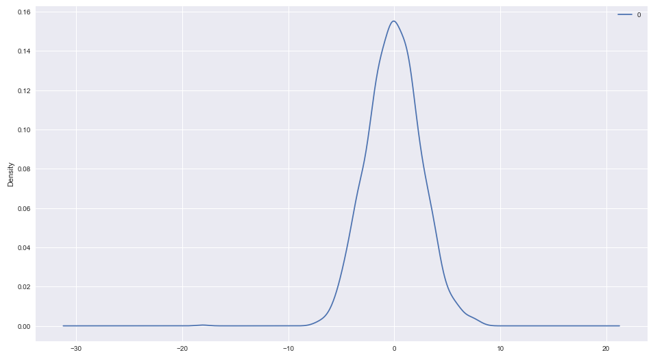
Next we will check if these residuals are normally distributed and looks Gaussian or not. So we will plot the density plot to check this. This looks normal with a long left tail and centered at Zero
residuals.plot(kind='kde')
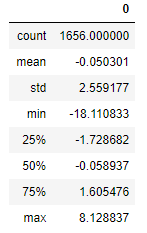
The mean of the residual is close to Zero and there is no significant correlation also that we can see in the pacf plot for residuals
residuals.describe()
plot_pacf(residuals)
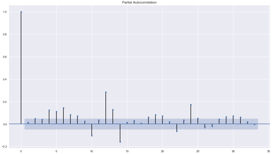
The residual diagnostics looks like a white noise since 95% of our sample autocorrelations is between the two blue lines and it meets all our criteria for a good forecast and prediction.
So Let’s go ahead and evaluate the Predicted and Expected Values
Arima Predict
Now we will use predict() function of Arimaresults objects to make predictions.
Predict function takes a start and end parameters to specify the index at which to start and stop the prediction
We could have done it another way also by splitting the train and test data and then comparing the test values with the predicted values
In our case we want to validate the predicted and expected value of first three years 1882-1885. so we will give a start value of 0 and end value of 36 and that will return an ndarray of predicted values
Using this returned value and the original value we will plot this and visualize how the predicted and real values differ. The red lines in the graph are original values and green are predicted values
from math import sqrt
from sklearn.metrics import mean_squared_error
plt.plot(df.temperature[:36],color='r')
plt.plot(results.predict(0,36),color='g')
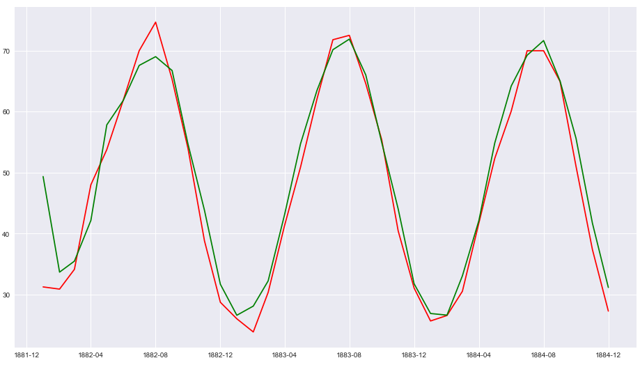
This looks good so far but how to quantify how the score of predicted vs Expected values. For this we will calculate the Root Mean Square Error values using Scipy
rmse =sqrt(mean_squared_error(df.temperature, results.predict()))
print(rmse)
2.56
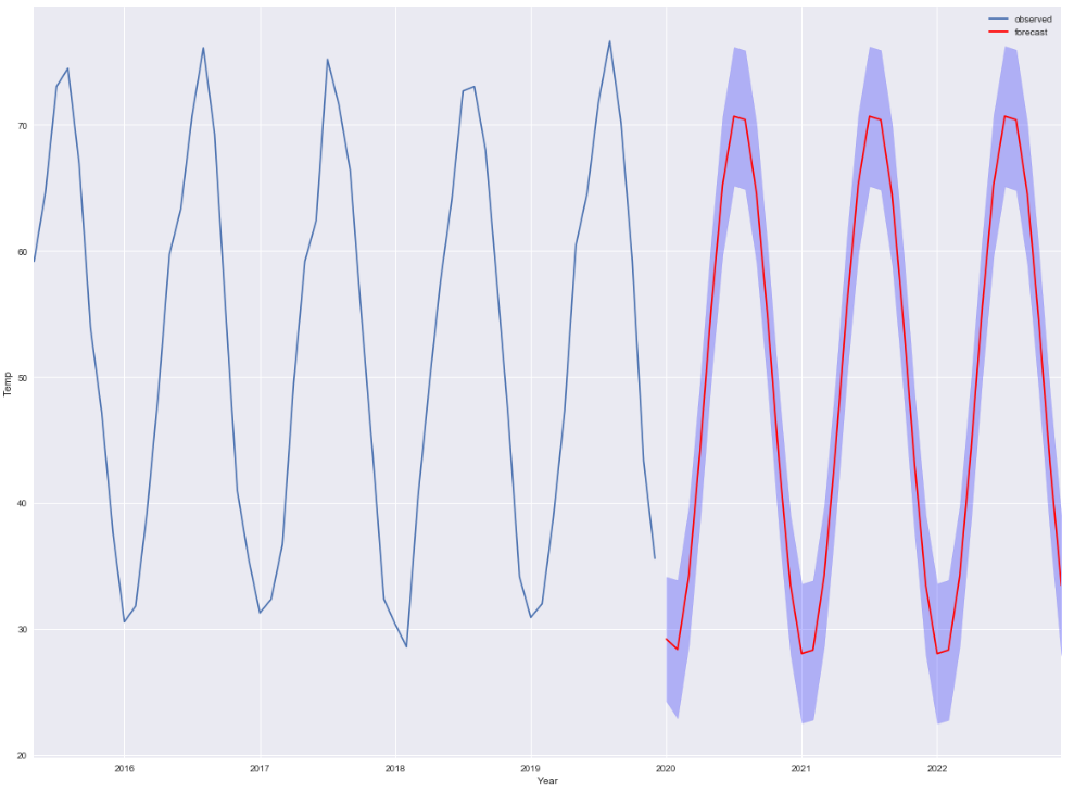
Forecast
Next and Final Step to forecast the temperature of upcoming years i.e. Out of Sample Forecast. We will use the forecast method of statsmodel for this task.
You can pass steps as one of the parameter i.e. number of out of sample forecasts from the end of the sample
And can provide the confidence interval(alpha) for your forecast too
This function will return following three values:
- Forecast : Array of Out of Sample forecast
- stderr : Array of the standard error of the forecasts
- confidence Interval : 2d array of the confidence interval for the forecast
We are forecasting the temperature for next 3 years i.e. 36 months so our steps will be 36 and for a confidence interval of 95% we will pass the alpha value as 0.05
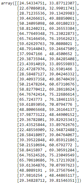
n=36
forecast,err,ci = results.forecast(steps=n,0.05)
df_forecast = pd.DataFrame({'forecast':forecast},index=pd.date_range(start='1/1/2020', periods=n, freq='MS'))
Forecast Interval
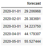
The confidence interval of the forecast is also returned by the ARIMAResult object.
It is stored in a variable ci above and this is how the interval value looks like
ci
Now we will plot the forecast value which is shown as red line for year 2020 thru 2023 in the below graph.
The blue strip that you see around the line is the forecast interval which is drawn with the help of fill_between() api of matplotlib
ax = df[1600:].temperature.plot(label='observed', figsize=(20, 15))
df_forecast.plot(ax=ax,label='Forecast',color='r')
ax.fill_between(df_forecast.index,
                ci[:,0],
                ci[:,1], color='b', alpha=.25)
ax.set_xlabel('Year')
ax.set_ylabel('Temp')

plt.legend()
plt.show()
Conclusion
Here are the key points that we discussed about time series modelling with ARIMA:
- Time Series Data Visualization is an important step to understand for analysis & forecasting and finding out the patterns in data
- Dickey-Fuller test performed to determine if the data is stationary or not. It’s necessary to check the stationarity before fitting the data to ARIMA
- Decomposition helps to remove the seasonality from the data and three components of decomposition are Trend, Seasonality and Residual
- Data differencing helps to remove stationarity from data and to determine the value of d
- Plot Auto-Correlation(ACF) and Partial Auto-Correlation (PACF) graph to determine the value of p and q
- Auto Arima package used to determine the value of p,q and d by evaluating the value of Akaike’s Information Criterion (AIC)
- Residual diagnosis is an important step post fitting the ARIMA model to evaluate if forecasting can be done with the fitted model or not
- Residual property of ARIMAResult object used for the Residual Analysis. If the residual is a white noise then we are good and ready for forecasting
- Cross validation and RMSE (Root Mean Square Error) calculated using the Predict function
- Out of sample forecast calculated using the Forecast function and gives forecast interval too
What’s Next?
There are few topics which I have not explained in detail like Additive and Multiplicative Model, Determine the p,q value by reading the ACF and PACF plot and using SARIMAX function for time series data with seasonality. So I would be covering those topics separately in my upcoming posts
Facebook has an open source tool Prophet for forecasting time series data and in my next post I will be using prophet to evaluate and compare the forecasting results with python statsmodel
Jupyter Notebook Github Link: https://github.com/min2bro/Time_Series_ARIMA/blob/master/Time%20Series%20Modelling%20-%20ARIMA.ipynb