Mataplotlib heatmap for correlation matrix using dataframe
Well most of the articles I found on google search page is about heatmap using seaborn, so this is something that motivated me to write this article about plotting a heatmap using Matplotlib
We will first create a dataframe of list of countries and their GDP, Population, GDP per capita, Agricutural land and CO2 emission as a separate columns in this dataframe. The values for these columns that I will be showing here is fake and doesn’t represent their real worth.
Once this dataframe is created then we will generate a correlation matrix to find out the correlation between each column of the dataframe and plot this correlation matrix heatmap using Matplotlib. Finally, we will also explore the pandas background_gradient style function that colors the background in a gradient style.
Create a dataframe
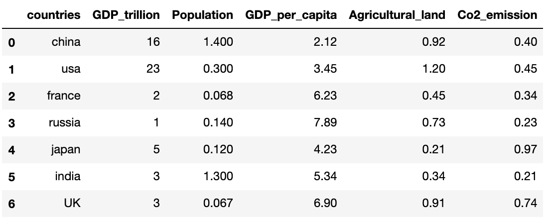
Let’s create a dataframe with all the following six columns: countries, GDP_trillion, population, GDP_per_capita, Agricultural_land and Co2_emission
import numpy as np
import matplotlib
import matplotlib.pyplot as plt
import pandas as pd

countries = ["china", "usa", "france", "russia",
              "japan", "india", "UK"]
GDP_trillion = [16, 23, 2, 1, 5, 3, 3]
Population = [1.4, 0.3, 0.068, 0.14, 0.12, 1.3, 0.067]
GDP_per_capita = [2.12, 3.45, 6.23, 7.89, 4.23, 5.34, 6.9]
Agricultural_land = [0.92, 1.2, 0.45, 0.73, 0.21, 0.34, 0.91]
Co2_emission = [0.40, 0.45, 0.34, 0.23, 0.97, 0.21, 0.74]

df=pd.DataFrame({
    'countries': countries,
    'GDP_trillion': GDP_trillion,
    'Population': Population,
    'GDP_per_capita': GDP_per_capita,
    'Agricultural_land': Agricultural_land,
    'Co2_emission': Co2_emission
})
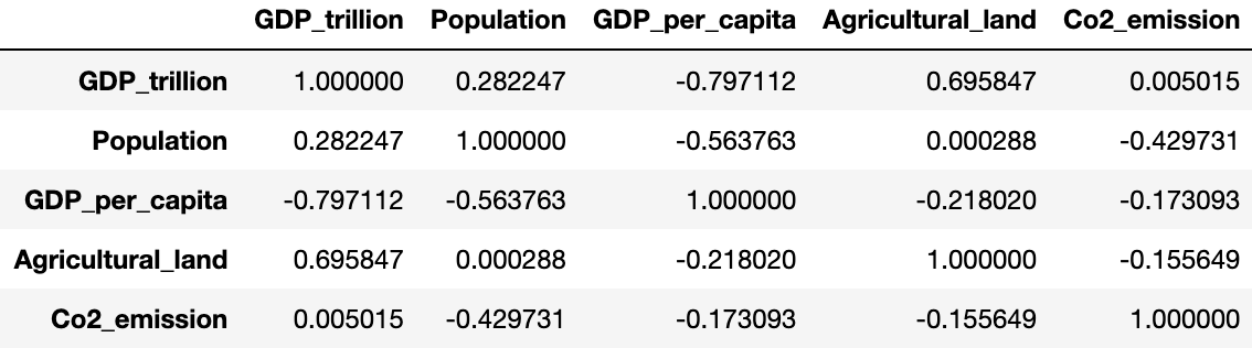
Create a correlation matrix of the Dataframe
what is a correlation matrix?
A correlation matrix basically shows the degree of correlations of every variable in the dataset with every other variable in the dataset.
Ideally, the correlation matrix is a representation of all these correlation coefficients of every single variable in the data with every other variable in the data.
The degree of correlation among any two variables has been depicted in two ways, the color of the box and the number inside the box.
The closer the number to 1, the greater the correlation. If the number is positive it states a positive correlation. If it is negative it states a negative correlation. 1 and -1 states perfect correlations among variables.
pear_corr=df.corr(method='pearson')
pear_corr
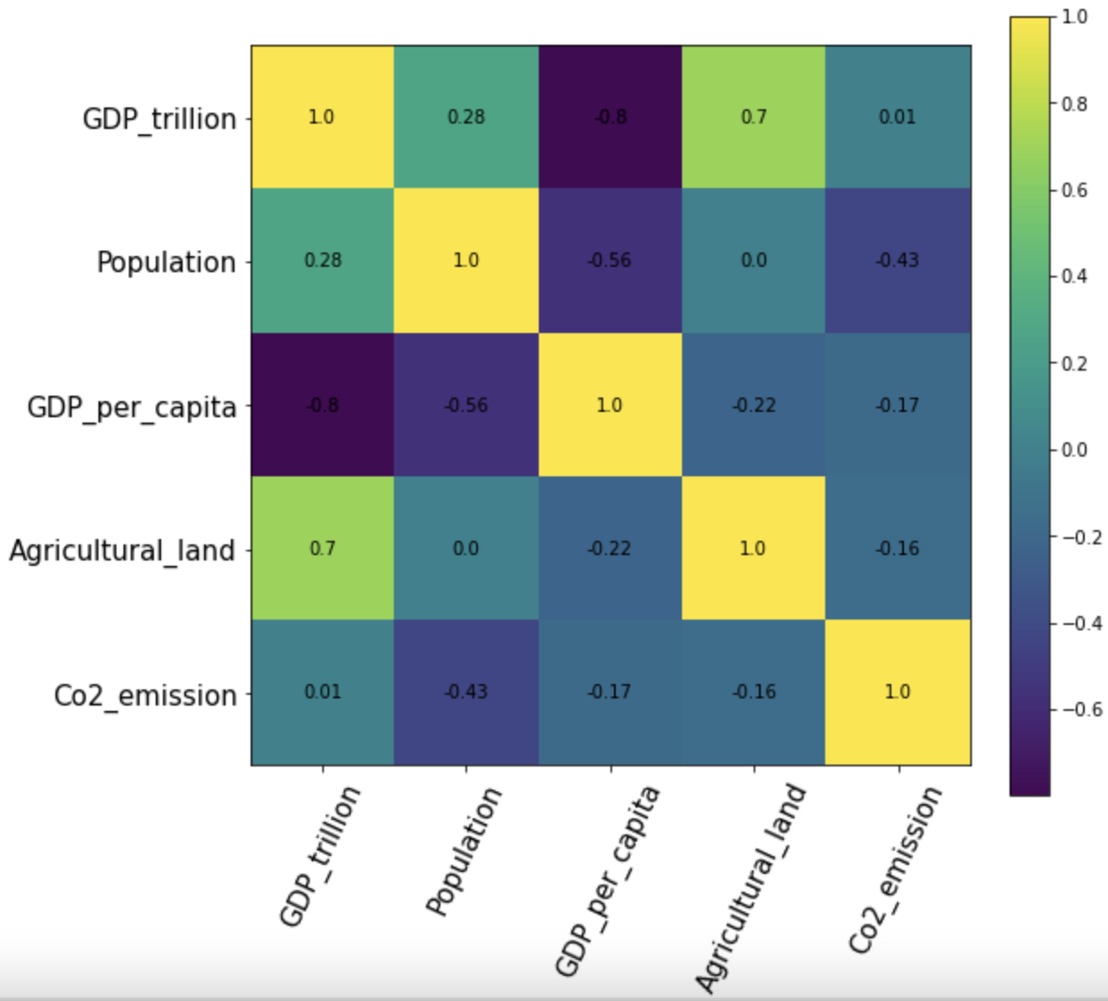
Plot Matplotlib heatmap of correlation matrix
we will create the heatmap of correlation matrix using matplotlib and we have to just pass the pear_corr matrix defined above in the matplotlib imshow function.
so we have first created a subplot of size 8x8 and then pass the pear_corr in the imshow function and set the interpolation to nearest. since we want a colorbar to represent the intensity of correlation values in this heatmap we have added that as well.
fig, ax = plt.subplots(figsize=(8,8))
im = ax.imshow(pear_corr, interpolation='nearest')
fig.colorbar(im, orientation='vertical', fraction = 0.05)
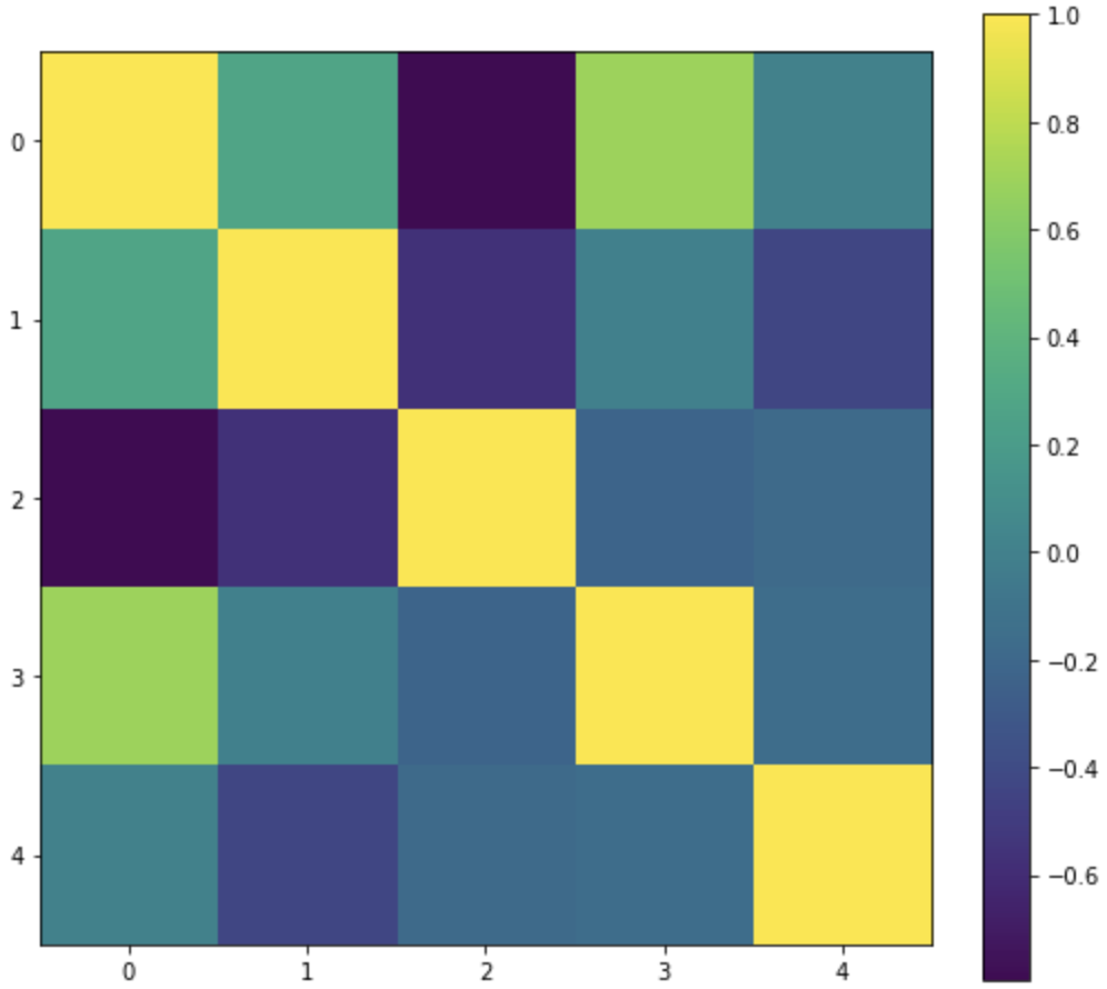
The output is just a color-coded heatmap but the axes labels and correlation score for each cell in the heatmap is missing
To create the axes ticks and to label them, we will use set_xticklabels and set_yticklabels function and the list of labels will be our dataframe column names i.e. df.columns
And to annotate the correlation score on the cells of this heatmap we will use text method of matplotlib to position and color the score labels
fig, ax = plt.subplots(figsize=(8,8))
im = ax.imshow(pear_corr, interpolation='nearest')
fig.colorbar(im, orientation='vertical', fraction = 0.05)

# Show all ticks and label them with the dataframe column name
ax.set_xticklabels(df.columns, rotation=65, fontsize=15)
ax.set_yticklabels(df.columns, rotation=0, fontsize=15)

# Loop over data dimensions and create text annotations
for i in range(len(df.columns)-1):
    for j in range(len(df.columns)-1):
        text = ax.text(j, i, round(pear_corr.to_numpy()[i, j], 2),
                       ha="center", va="center", color="black")

plt.show()
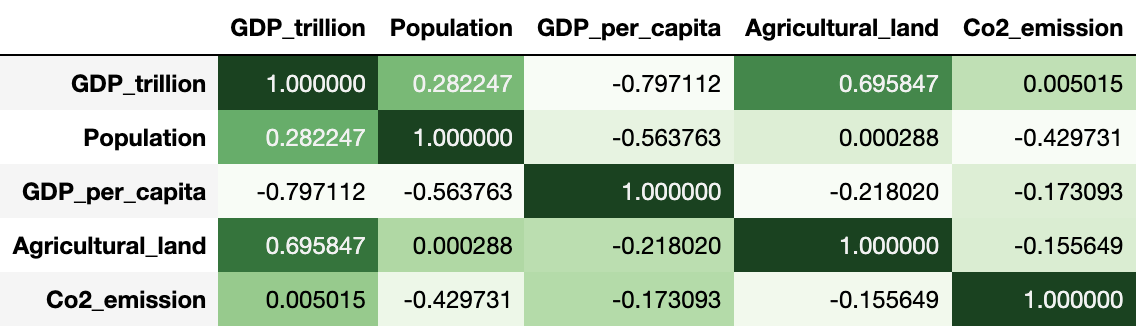
Using Pandas background_gradient for heatmap
Alternatively, if you are working on a dataframe like the correlation matrix dataframe(pears_corr) created above we can use pandas background_gradient style function as well.
The background color is determined according to the data in each column, row or frame, or by a given gradient map. It requires a matplotlib too as a background.
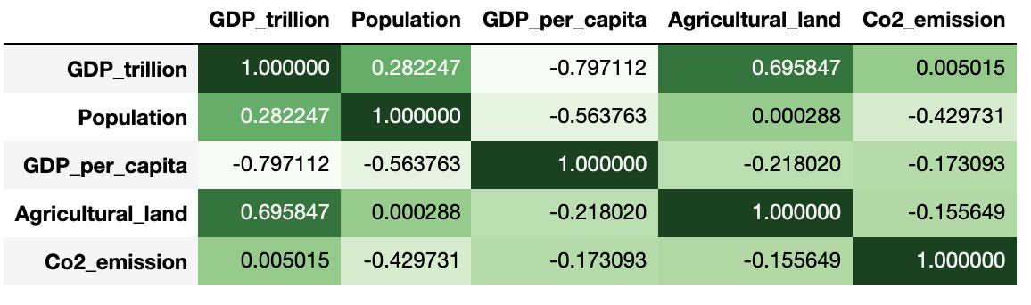
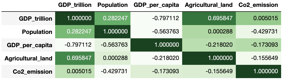
Across Column
Just in case you wanted to only apply the color code heatmap along the column of the dataframe then set the axis=0. Also, in the below figure, the darker the green color, the greater the positive correlation, the darker the red color of the box the greater the negative correlation across each column.
pear_corr.style.background_gradient(cmap='Greens', axis=0)
Across Rows
if we want to apply the color code heatmap just across each rows in the dataframe then set the axis=1
pear_corr.style.background_gradient(cmap='Greens', axis=1)
For entire Dataframe
Finally, if axis = None then it is applied across the entire dataframe
pear_corr.style.background_gradient(cmap='Greens')
There is an optional parameter called gmap or Gradient map for determining the background colors. You can either pass the entire dataframe as a gmap or pass a ndarray or list-like must be an identical shape to the underlying data
pear_corr.style.background_gradient(cmap='Greens', gmap=gmap)