How to prevent xticks overlapping in matplotlib
In this article, we will explore how to prevent overlapping x-axis tick labels. When plotting data in a graph, the labels of the x and y axes may sometimes overlap.
When the data is large to plot, the ticks squishes themselves to fit the figure. Which in most cases works but it does not look good visually.
Matplotlib provides with a number of functions to help overcome this. It provides functions to change and customize the text properties of the xticks label.
Here are the list of functions used in this article to format the tick labels and make it clean:
- autofmt_date
- xticks
- set_xticks
- set_xticklabels
- tick_params
- setp
- xlim
- set_major_locator()
- set_minor_locator()
- get_xaxis().set_visible(False)
Create Dataframe
We will use the weather dataset. We will only use 4 columns. This dataset is also available in Kaggle for easy access.
# importing required libraries
import pandas as pd
from matplotlib import pyplot as plt

# creating dataframe with 4 columns from the csv
columns = ['Data.Precipitation', 'Date.Full',
           'Station.City', 'Data.Temperature.Avg Temp']

df = pd.read_csv('/kaggle/input/rain-dataset/weather.csv',
                 usecols = columns)

# renaming the column names
df = df.rename( columns =
               {
                 'Date.Full': 'Date',
                 'Data.Precipitation' :'Precipitation',
                 'Station.City':'City',
                 'Data.Temperature.Avg Temp':'Avg_Temp'
                 },
               inplace = False)

# printing the dataframe
df
Out:
| Precipitation | Date | City | Avg_Temp | |
|---|---|---|---|---|
| 0 | 0.00 | 2016-01-03 | Birmingham | 39 |
| 1 | 0.00 | 2016-01-03 | Huntsville | 39 |
| 2 | 0.16 | 2016-01-03 | Mobile | 46 |
| 3 | 0.00 | 2016-01-03 | Montgomery | 45 |
| 4 | 0.01 | 2016-01-03 | Anchorage | 34 |
| … | … | … | … | … |
| 16738 | 0.08 | 2017-01-01 | Casper | 23 |
| 16739 | 0.00 | 2017-01-01 | Cheyenne | 32 |
| 16740 | 0.00 | 2017-01-01 | Lander | 17 |
| 16741 | 0.06 | 2017-01-01 | Rawlins | 23 |
| 16742 | 0.10 | 2017-01-01 | Sheridan | 21 |
16743 rows × 4 columns
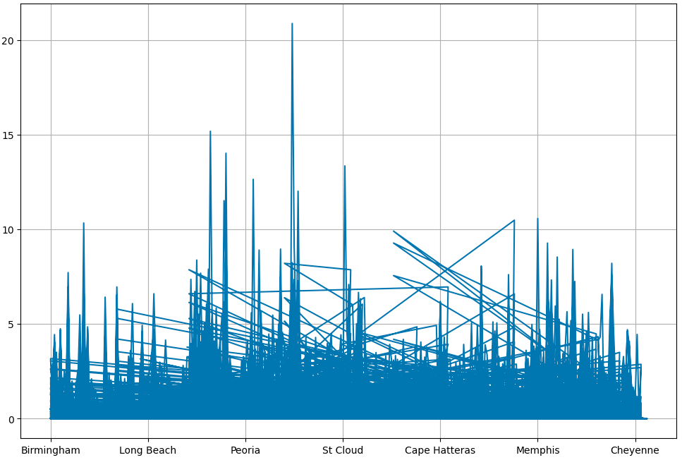
plotting the data
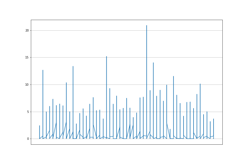
# plotting date and precipitation
plt.plot(df['Date'], df['Precipitation'])

plt.grid()
plt.show()
This shows overlapping x-axis tick labels. This is because our dataset has 16743 rows.
Increase figure size - figsize
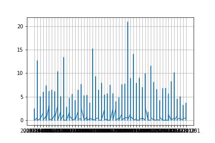
In most cases overlapping of tick labels happens when the data is large. One of the easiest way to overcome overlapping is by increasing the figure size. Just by adjusting the figsize the graph looks better.
# setting the figure size
plt.figure(figsize = (20,8))

plt.plot(df['Date'], df['Precipitation'])
plt.grid()
plt.show()
The output is not clean even when we set it to a wide width size.
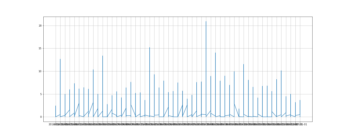
autofmt_xdate
autofmt_xdate is one of the function that formats the datetime x-axis tick label. It auto formats the datetime column.
There are other functions which are datetime exclusive formatter functions but this is the fastest way of formatting a datetime column.
The auto rotation is set at 30 degrees. We will adjust the size of the graph using figsize for a clean graph.
fig, ax = plt.subplots(1, figsize = (20, 8))
ax.grid()
fig.autofmt_xdate()
plt.plot(df['Date'], df['Precipitation'])
plt.show()
The above graph and this has the same width but the x-axis ticks look clean and formatted here.
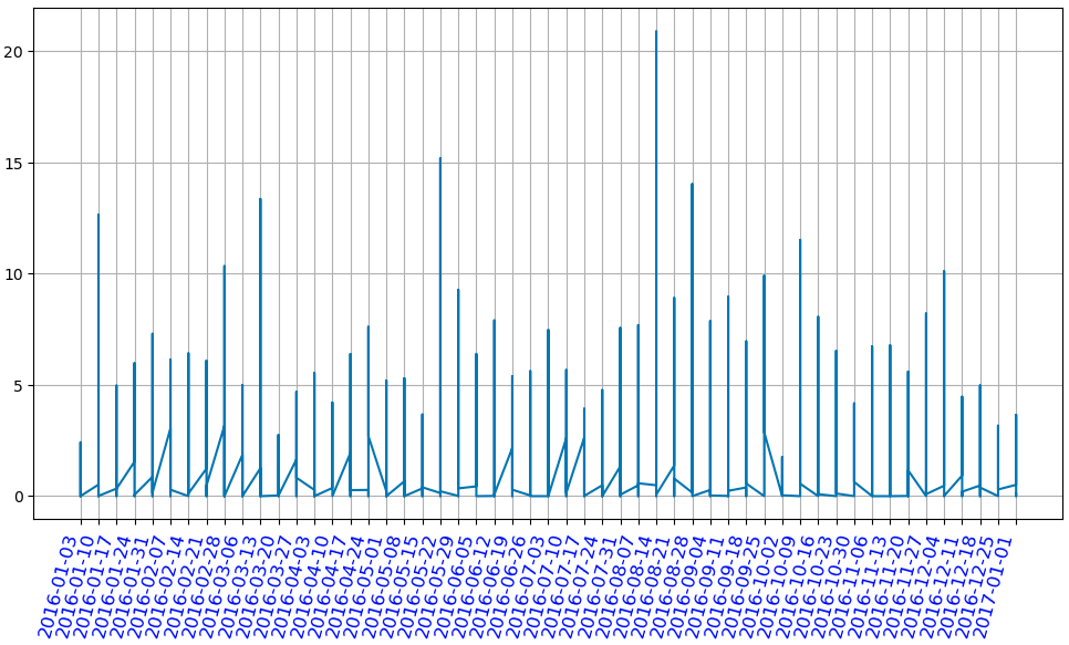
x-axis tick label rotation
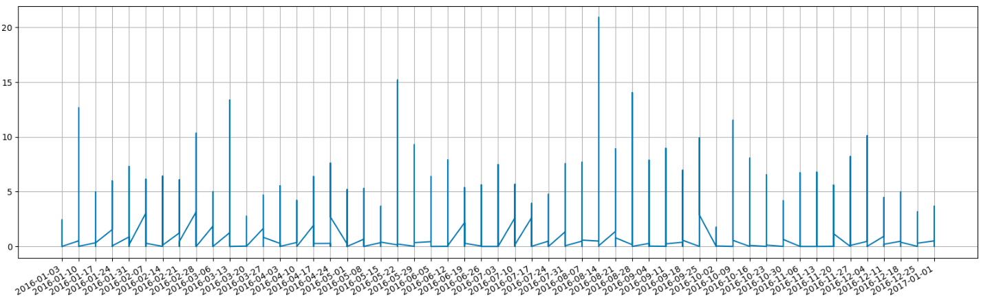
The default text direction of the x-axis tick label is horizontal. Matplotlib has various functions which allows rotation of xticks label. We will be rotating the x-axis tick labels using the following functions - xticks(), set_ticks(), set_xticklabels(), tick_params(), setp()
xticks
fig, ax = plt.subplots(1, figsize = (12, 8))
ax.grid()
plt.xticks(rotation = 75)
plt.plot(df['Date'], df['Precipitation'])
plt.show()
set_xticks / set_xticklabels
fig, ax = plt.subplots(figsize = (12, 8))
ax.grid()
plt.plot(df['Date'], df['Precipitation'])
ax.set_xticks(df['Date'])
ax.set_xticklabels(df['Date'], rotation = 75)
plt.show()
tick_params
fig, ax = plt.subplots(figsize = (12, 8))
ax.grid()
plt.plot(df['Date'], df['Precipitation'])
ax.tick_params(axis='x', labelrotation = 75)
plt.show()
setp
fig, ax = plt.subplots(figsize = (12, 8))
ax.grid()
plt.plot(df['Date'], df['Precipitation'])
plt.setp(ax.get_xticklabels(), rotation = 75)
plt.show()
Format - fontsize, alignment/direction, color
In this section, we will see how to change the format of x-axis tick label. We will change the font size and color of the xticks label to make it look better.
xticks
fig, ax = plt.subplots(figsize = (12,8))
ax.grid()
plt.plot(df['Date'], df['Precipitation'])
plt.xticks(rotation = 75, ha = 'right',
           fontsize = 12, color = 'blue')
plt.show()
set_xticks & set_xtickslabels
fig, ax = plt.subplots(figsize = (12,8))
ax.grid()
plt.plot(df['Date'], df['Precipitation'])
ax.set_xticks(df['Date'])
ax.set_xticklabels(df['Date'], rotation = 75,
                   ha = 'right', fontsize = 12,
                   color = 'blue')
plt.show()
tick_params
fig, ax = plt.subplots(figsize = (12,8))
ax.grid()
plt.plot(df['Date'], df['Precipitation'])
ax.tick_params(axis='x', labelrotation = 75,
               direction = 'in', labelsize = 12,
               colors = 'blue')
plt.show()
setp
fig, ax = plt.subplots(figsize = (12,8))
ax.grid()
plt.plot(df['Date'], df['Precipitation'])
plt.setp(ax.get_xticklabels(), rotation = 75,
         ha = 'right', fontsize = 12,
         color = 'blue')
plt.show()
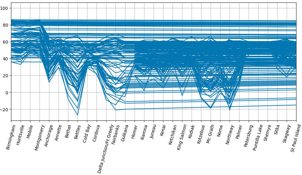
Limit the number of xticks
These are some ways in which you can limit/reduce the number of xticks label in the graph. We will use xlim, set_major_locator in this section.
xlim
We can set the number of xticks by assigning xlim a range. It will give that exact range as the xticks label.
fig, ax = plt.subplots(figsize = (12, 8))
ax.grid()
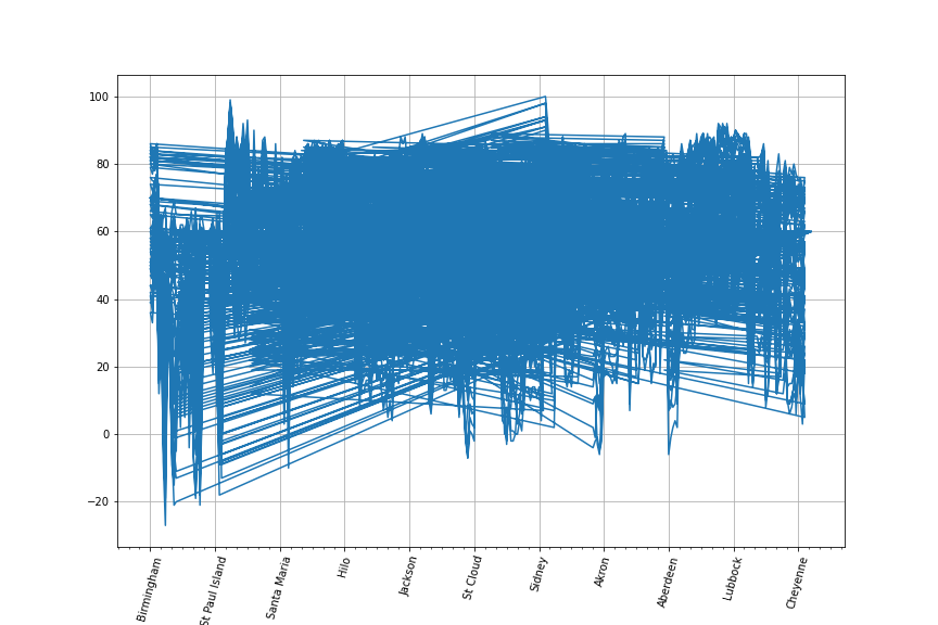
plt.plot(df['City'], df['Avg_temp'])
plt.xticks(rotation = 75)
plt.xlim(0, 30)
plt.show()
ticker - AutoLocator
Ticker has various functions to set the major and minor ticks. We will use the AutoLocator in this example. It auto locates the xticks label. We have to import the ticker functions from the matplotlib.ticker library.
from matplotlib.ticker import (AutoMinorLocator,
                               MultipleLocator)

# AutoLocator
fig, ax = plt.subplots(figsize = (12, 8))
ax.grid()
plt.plot(df['City'], df['Precipitation'])
ax.xaxis.set_major_locator(plt.AutoLocator())
plt.show()
ticker - MultipleLocator
MultipleLocator: Ticks and range are a multiple of base
By configuring MultipleLocator we can find ticks that are a multiple of the number you set it to. MultipleLocator allows us to use of major and minor ticks. We will use both in this example.
from matplotlib.ticker import (AutoMinorLocator, MultipleLocator)

# MultipleLocator
fig, ax = plt.subplots(figsize = (12, 8))
ax.grid()
plt.plot(df['City'], df['Avg_temp'])
plt.xticks(rotation = 75)
ax.xaxis.set_major_locator(MultipleLocator(30))
ax.xaxis.set_minor_locator(MultipleLocator(5))
plt.show()
The above three functions give different result. It is useful to use them as per the data at hand.
invisible x-axis tick labels
A different approach to tackle overlapping of x-axis xticks label is to hide the xticks. It is achieved by making it invisible. This helps with a clean graph look.
xticks
fig, ax = plt.subplots(figsize = (12, 8))
ax.grid()
plt.plot(df['Date'], df['Precipitation'])
plt.xticks(color = 'w')
plt.show()
set_xticks
fig, ax = plt.subplots(figsize = (12, 8))
ax.grid()
plt.plot(df['Date'], df['Precipitation'])
ax.set_xticks([])
plt.show()
get_xaxis().set_visible(False)
fig, ax = plt.subplots(figsize = (12, 8))
ax.grid()
plt.plot(df['Date'], df['Precipitation'])
ax.get_xaxis().set_visible(False)
plt.show()
NullLocator
fig, ax = plt.subplots(figsize = (12, 8))
ax.grid()
plt.plot(df['Date'], df['Precipitation'])
ax.xaxis.set_major_locator(ticker.NullLocator())
plt.show()
All the above functions give this output